This article describes how to compute and automatically add p-values onto ggplot facets with different scales using the ggpubr and the rstatix R packages. For multipanel plots with approximately similar y-axis scales on each panel, you can follow steps described in this article: How to Add P-values to GGPLOT Facets.
Here, we’ll We’ll use a demo data for creating panels of plots with very different y scales. You will learn how correctly auto-compute the y positions of the p-values when the facet scales is set to free option. Examples are shown for box plots and bar plots.
Contents:
Prerequisites
Read the following related article: How to Add P-values to GGPLOT Facets.
Make sure you have installed the following R packages:
tidyversefor data manipulation and visualizationggpubrfor creating easily publication ready plotsrstatixprovides pipe-friendly R functions for easy statistical analyses.
Start by loading the following required packages:
library(ggpubr)
library(rstatix)
Data preparation
# Transform `dose` into factor variable
df <- ToothGrowth
df$dose <- as.factor(df$dose)
# Add a random grouping variable
df$group <- factor(rep(c("grp1", "grp2"), 30))
# Add some extremely high values in column 1 at rows c(1, 3, 5).
df[c(1, 3, 5),  1] <- c(500, 495, 505)
head(df, 3)
## len supp dose group
## 1 500.0 VC 0.5 grp1
## 2 11.5 VC 0.5 grp2
## 3 495.0 VC 0.5 grp1Statistical tests
Facet by the supp and group variables, and compare the levels of the dose variable on the x-axis. The Tukey post hoc test is used for the pairwise comparisons.
stat.test <- df %>%
  group_by(group, supp) %>%
  tukey_hsd(len ~ dose)
stat.test
## # A tibble: 12 x 11
## supp group term group1 group2 null.value estimate conf.low conf.high p.adj p.adj.signif
## * <fct> <fct> <chr> <chr> <chr> <dbl> <dbl> <dbl> <dbl> <dbl> <chr>
## 1 OJ grp1 dose 0.5 1 0 6.32 0.275 12.4 0.0403 *
## 2 OJ grp1 dose 0.5 2 0 11.3 5.26 17.3 0.000852 ***
## 3 OJ grp1 dose 1 2 0 4.98 -1.06 11.0 0.112 ns
## 4 VC grp1 dose 0.5 1 0 -286. -548. -23.5 0.0328 *
## 5 VC grp1 dose 0.5 2 0 -276. -539. -14.0 0.0389 *
## 6 VC grp1 dose 1 2 0 9.46 -253. 272. 0.995 ns
## # … with 6 more rowsFacet with fixed scales
# Create bar plots with significance levels
# Hide ns (non-significant)
# Add 15% space between labels and the plot top border
stat.test <- stat.test %>% add_xy_position(x = "dose", fun = "mean_se")
ggbarplot(
  df, x = "dose", y = "len", fill = "#00AFBB",
  add = "mean_se", facet = c("supp", "group")
  ) +
  stat_pvalue_manual(stat.test, hide.ns = TRUE, tip.length = 0, step.increase = 0) +
  scale_y_continuous(expand = expansion(mult = c(0.05, 0.15)))
Facet with free scales
Facet wrap
You need to specify the option scales = "free" in both the add_xy_position() and in the ggbarplot() functions.
stat.test <- stat.test %>%
  add_xy_position(x = "dose", fun = "mean_se", scales = "free")
ggbarplot(
  df, x = "dose", y = "len", fill = "#00AFBB",
  add = "mean_se", facet.by = c("supp", "group")
  ) +
  facet_wrap(vars(supp, group), scales = "free") +
  stat_pvalue_manual(stat.test, hide.ns = TRUE, tip.length = 0) +
  scale_y_continuous(expand = expansion(mult = c(0.05, 0.15)))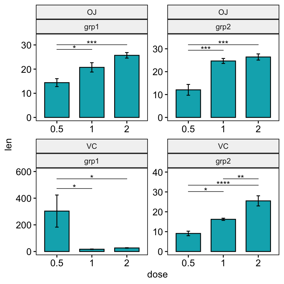
Facet grid
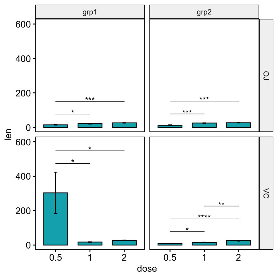
When the scales = "free" argument is added in facet grid, plots on the same row cannot have different y-axis. Similarly, there can be only single x-axis for each column. Using facet_wrap(), each plot is displayed independently, so it can “free” its x-axis and y-axis.
Facet grid is useful when you want to relatively compare the plots within a category, which can be accomplished by setting the same axis scales. Meanwhile, facet wrap is more useful for plots that are more independent between one another.
There are two possible solutions to customize the y position of significance levels.
Solution 1: Using the option step.increase
The default of the function add_xy_position() is to automatically compute a global step increase value between brackets. This calculation assumes that the y scales of plot panels are fixed.
In the situation, where you want free scales, you can:
- Set the option
step.increaseto 0 when calling the functionadd_xy_position(). - Specify only the option
step.increasein the functionstat_pvalue_manual(). In this case, the step.increase will be adapted to each plot panel.
stat.test <- stat.test %>%
  add_xy_position(x = "dose", fun = "mean_se", step.increase = 0)
bp <- ggbarplot(
  df, x = "dose", y = "len", fill = "#00AFBB", add = "mean_se",
  facet.by = c("supp", "group"), scales = "free"
  )
bp +
  stat_pvalue_manual(stat.test, hide.ns = TRUE, tip.length = 0, step.increase = 0.2) +
  scale_y_continuous(expand = expansion(mult = c(0.05, 0.15)))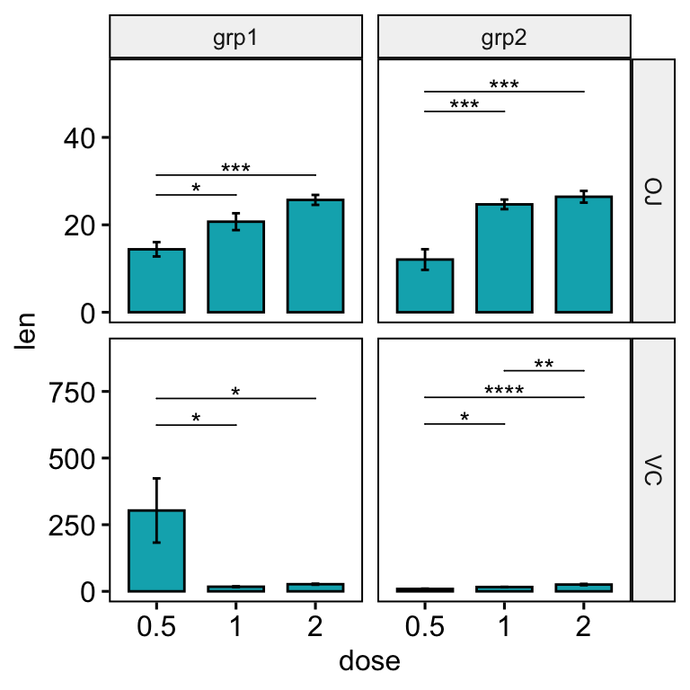
Solution 2: Using the option scales = “free”.
In facet grid, the scales of the generated plot panels are not completely free. Consequently you will need more customization to adapt the look of the significance level position. You will have to play with the options step.increase and bracket.nudge.y in the stat_pvalue_manual() function.
# Default plot
stat.test <- stat.test %>%
  add_xy_position(x = "dose", fun = "mean_se", scales = "free")
bp <- ggbarplot(
  df, x = "dose", y = "len", fill = "#00AFBB", add = "mean_se",
  facet.by = c("supp", "group"), scales = "free"
  )
bp +
  stat_pvalue_manual(stat.test, hide.ns = TRUE, tip.length = 0) +
  scale_y_continuous(expand = expansion(mult = c(0.05, 0.15)))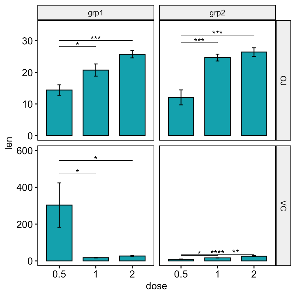
# Increase the step between the brackets
bp +
  stat_pvalue_manual(
    stat.test, hide.ns = TRUE, tip.length = 0,
    step.increase = 0.1
    ) +
  scale_y_continuous(expand = expansion(mult = c(0.05, 0.15)))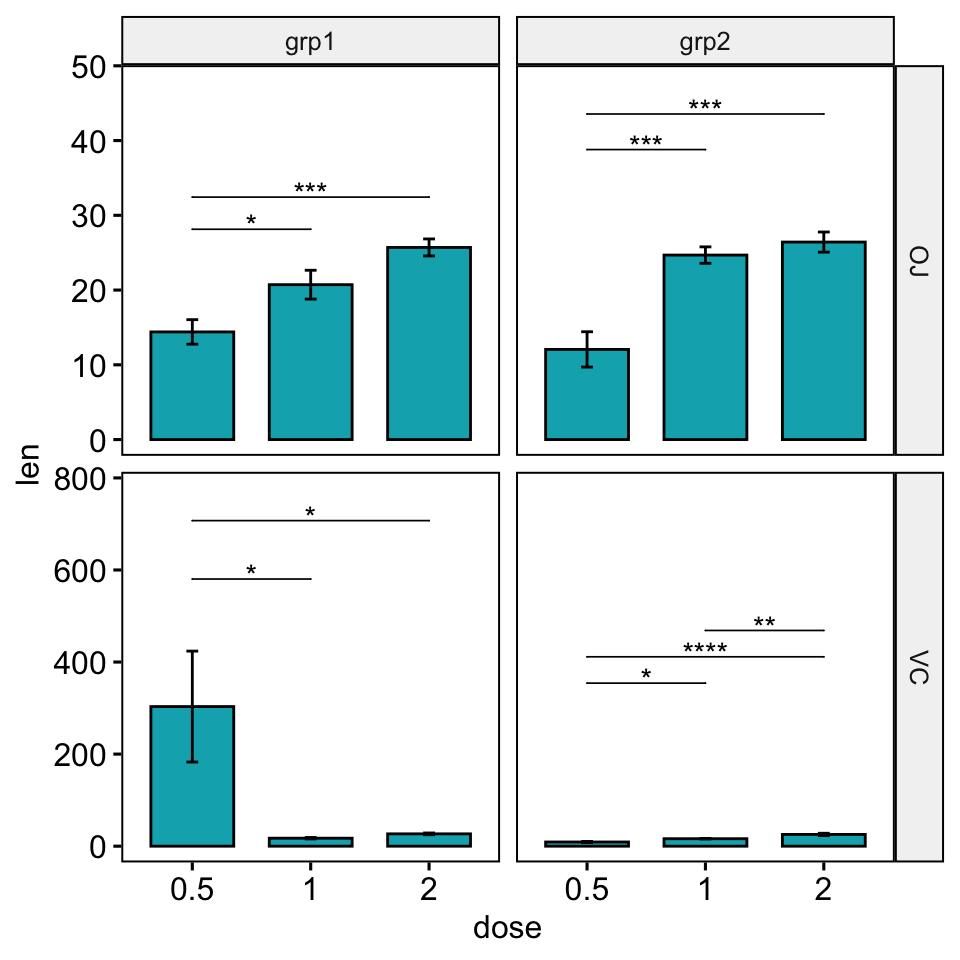
# Nudge down the brackets
# Specify the option bracket.nudge.y for each of the panel
# Should be of the same length as the number of comparisons
bracket.nudge.y <- c(
  -2, -3,               # Panel 1: grp1/OJ
  -100, -160,           # Panel 2: grp1/VC
  -10, -11,             # Panel 3: grp2/OJ
  -250, -250, -250      # Panel 4: grp2/VC
  )
bp +
  stat_pvalue_manual(
    stat.test, hide.ns = TRUE, tip.length = 0,
    step.increase = 0.09, bracket.nudge.y = bracket.nudge.y
    ) +
  scale_y_continuous(expand = expansion(mult = c(0.05, 0.15)))
Conclusion
This article describes how to add p-values onto ggplot facets with different y scales. See other related frequently questions: ggpubr FAQ.
Recommended for you
This section contains best data science and self-development resources to help you on your path.
Books - Data Science
Our Books
- Practical Guide to Cluster Analysis in R by A. Kassambara (Datanovia)
- Practical Guide To Principal Component Methods in R by A. Kassambara (Datanovia)
- Machine Learning Essentials: Practical Guide in R by A. Kassambara (Datanovia)
- R Graphics Essentials for Great Data Visualization by A. Kassambara (Datanovia)
- GGPlot2 Essentials for Great Data Visualization in R by A. Kassambara (Datanovia)
- Network Analysis and Visualization in R by A. Kassambara (Datanovia)
- Practical Statistics in R for Comparing Groups: Numerical Variables by A. Kassambara (Datanovia)
- Inter-Rater Reliability Essentials: Practical Guide in R by A. Kassambara (Datanovia)
Others
- R for Data Science: Import, Tidy, Transform, Visualize, and Model Data by Hadley Wickham & Garrett Grolemund
- Hands-On Machine Learning with Scikit-Learn, Keras, and TensorFlow: Concepts, Tools, and Techniques to Build Intelligent Systems by Aurelien Géron
- Practical Statistics for Data Scientists: 50 Essential Concepts by Peter Bruce & Andrew Bruce
- Hands-On Programming with R: Write Your Own Functions And Simulations by Garrett Grolemund & Hadley Wickham
- An Introduction to Statistical Learning: with Applications in R by Gareth James et al.
- Deep Learning with R by François Chollet & J.J. Allaire
- Deep Learning with Python by François Chollet
Version:
 Français




This will be very helpful. However, the rstatix version 0.6.0 I just installed returns “unused argument (scales = “free”)” error message. Is there a newer version that takes the scales argument?
This option is available in the latest dev version (not on CRAN yet), which can be installed as follow: devtools::install_github(“kassambara/rstatix”)
Hi,
the new scales = “free” argument seems to be a very welcome new feature. However, when I try to install the latest version from
devtools::install_github(“kassambara/rstatix”), I get the following message:
Error: Failed to install ‘rstatix’ from GitHub:
(converted from warning) installation of package ‘/var/folders/fl/lrh0tkf16_j29g5lgw6vsvpw0000gn/T//RtmpI4YwFc/fileb2e03c48f23b/rstatix_0.6.0.999.tar.gz’ had non-zero exit status
Any suggestions would be highly appreciated.
Thanks a lot 🙂
Daniel
With the v0.6.0 rstatix I just installed (I’m using R-3.6.1), the “facet with free scales” example code does not work. The line stat.test <- stat.test %>% add_xy_position(x = "dose", fun = "mean_se", scales = "free") returns error message:
Error in add_y_position(., fun = fun, step.increase = step.increase, stack = stack, : unused argument (scales = "free")
This option is available in the latest dev version (not on CRAN yet), which can be installed as follow: devtools::install_github(“kassambara/rstatix”)
Thanks. I thought my first post didn’t go through. Please delete the first duplicate.
Thanks. One of the dependencies of the rstatix installation, broom v0.7.0, seemed to have incompatibility issue and causing problems on other functions. Is v0.7.0 needed? Is there a way to specify using lower versions like 0.5.2? Thanks!
Thanks. One of the dependencies of the rstatix installation, broom v0.7.0, seemed to have incompatibility issue and causing problems on other functions. Is v0.7.0 needed? Is there a way to specify using lower versions like 0.5.2? Thanks!
Hello! because I used scale_x_discrete to re order the factors on the x axis, now the Tukey results are not in the right order when using stat_pvalue_manual. Is there a solution to plot in the right order? Thanks a lot!
Hello!
To avoid this issue, the easiest solution is to modify your data by defining the grouping variable level order, using R code like this:
Then, use the data to do statistical tests and plots. In this case, you don’t need
scale_x_discrete().Hi!
How can I add add p-values generated elsewhere to a facet_wrap with different scales? How can I set the y.position to be 1.1 times bigger than the maximum value in each panel?
The tutorials show how to do that with p-values obtained from the rstatix package, but I want to use already computed p-values.
Thank you very much!
Hi, tried running this with my data:
stat.test % add_xy_position(x = “dose”, fun = “mean_se”)
where dose in my case is “A” vs “B” for 11 species (supp) at 4 timepoint categories (group)
and I get this error message:
Error in `tidyr::unnest()`:
! Can’t duplicate names between the affected columns and the original data.
✖ These names are duplicated:
ℹ `variable`, from `data`.
ℹ Use `names_sep` to disambiguate using the column name.
ℹ Or use `names_repair` to specify a repair strategy.
Run `rlang::last_error()` to see where the error occurred.
have you seen this before?