A radar chart, also known as a spider plot is used to visualize the values or scores assigned to an individual over multiple quantitative variables, where each variable corresponds to a specific axis.
This article describes how to create a radar chart in R using two different packages: the fmsb or the ggradar R packages.
Note that, the fmsb radar chart is an R base plot. The ggradar package builds a ggplot spider plot.
You will learn:
- how to create a beautiful fmsb radar chart
- how to create ggplot radar chart
- alternatives to radar charts
Contents:
Demo data
We’ll use a demo data containing exam scores for 3 students on 9 topics (Biology, Physics, etc). The scores range from 0 to 20. Columns are quantitative variables and rows are individuals.
# Demo data
exam_scores <- data.frame(
    row.names = c("Student.1", "Student.2", "Student.3"),
      Biology = c(7.9, 3.9, 9.4),
      Physics = c(10, 20, 0),
        Maths = c(3.7, 11.5, 2.5),
        Sport = c(8.7, 20, 4),
      English = c(7.9, 7.2, 12.4),
    Geography = c(6.4, 10.5, 6.5),
          Art = c(2.4, 0.2, 9.8),
  Programming = c(0, 0, 20),
        Music = c(20, 20, 20)
)
exam_scores
## Biology Physics Maths Sport English Geography Art Programming Music
## Student.1 7.9 10 3.7 8.7 7.9 6.4 2.4 0 20
## Student.2 3.9 20 11.5 20.0 7.2 10.5 0.2 0 20
## Student.3 9.4 0 2.5 4.0 12.4 6.5 9.8 20 20fmsb radar chart
Prerequisites
Install the fmsb R package:
install.packages("fmsb")Load the package:
library(fmsb)Data preparation
The data should be organized as follow:
- The row 1 must contain the maximum values for each variable
- The row 2 must contain the minimum values for each variable
- Data for cases or individuals should be given starting from row 3
- The number of columns or variables must be more than 2.
# Define the variable ranges: maximum and minimum
max_min <- data.frame(
  Biology = c(20, 0), Physics = c(20, 0), Maths = c(20, 0),
  Sport = c(20, 0), English = c(20, 0), Geography = c(20, 0),
  Art = c(20, 0), Programming = c(20, 0), Music = c(20, 0)
)
rownames(max_min) <- c("Max", "Min")

# Bind the variable ranges to the data
df <- rbind(max_min, exam_scores)
df
## Biology Physics Maths Sport English Geography Art Programming Music
## Max 20.0 20 20.0 20.0 20.0 20.0 20.0 20 20
## Min 0.0 0 0.0 0.0 0.0 0.0 0.0 0 0
## Student.1 7.9 10 3.7 8.7 7.9 6.4 2.4 0 20
## Student.2 3.9 20 11.5 20.0 7.2 10.5 0.2 0 20
## Student.3 9.4 0 2.5 4.0 12.4 6.5 9.8 20 20Basic radar plot
# Plot the data for student 1
library(fmsb)
student1_data <- df[c("Max", "Min", "Student.1"), ]
radarchart(student1_data)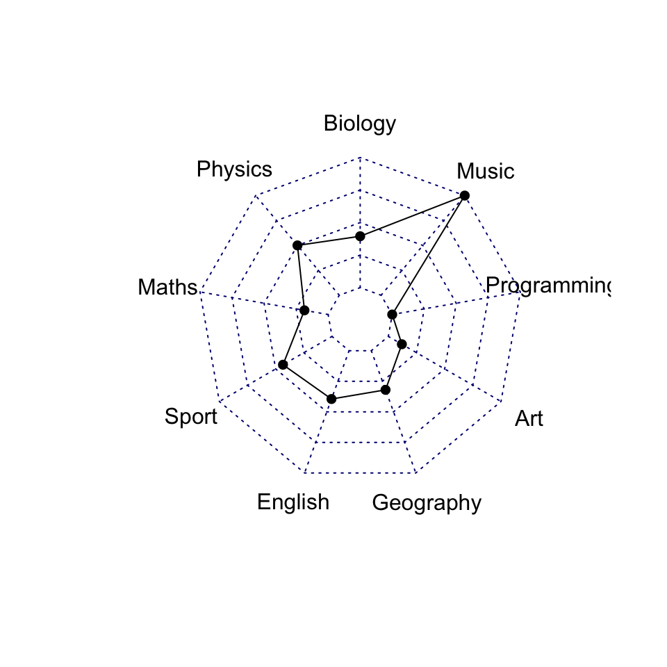
It can be seen that the Student 1 has a high score in Music and Physics compared to the other topics.
Customize the radar charts
Key arguments to customize the different components of the fmsb radar chart:
- Variable options
vlabels: variable labelsvlcex: controls the font size of variable labels
- Polygon options:
pcol: line colorpfcol: fill colorplwd: line widthplty: line types. Can be a numeric vector 1:6 or a character vector c(“solid”, “dashed”, “dotted”, “dotdash”, “longdash”, “twodash”). To remove the line, useplty = 0orplty = “blank”.
- Grid options:
cglcol: line colorcglty: line typecglwd: line width
- Axis options:
axislabcol: color of axis label and numbers. Default is “blue”.caxislabels: Character vector to be used as labels on the center axis.
Helper function to produce a beautiful radar chart:
create_beautiful_radarchart <- function(data, color = "#00AFBB",
                                        vlabels = colnames(data), vlcex = 0.7,
                                        caxislabels = NULL, title = NULL, ...){
  radarchart(
    data, axistype = 1,
    # Customize the polygon
    pcol = color, pfcol = scales::alpha(color, 0.5), plwd = 2, plty = 1,
    # Customize the grid
    cglcol = "grey", cglty = 1, cglwd = 0.8,
    # Customize the axis
    axislabcol = "grey",
    # Variable labels
    vlcex = vlcex, vlabels = vlabels,
    caxislabels = caxislabels, title = title, ...
  )
}
In the code above, we used the function alpha() [in scales package] to change the polygon fill color transparency.
# Reduce plot margin using par()
op <- par(mar = c(1, 2, 2, 1))
create_beautiful_radarchart(student1_data, caxislabels = c(0, 5, 10, 15, 20))
par(op)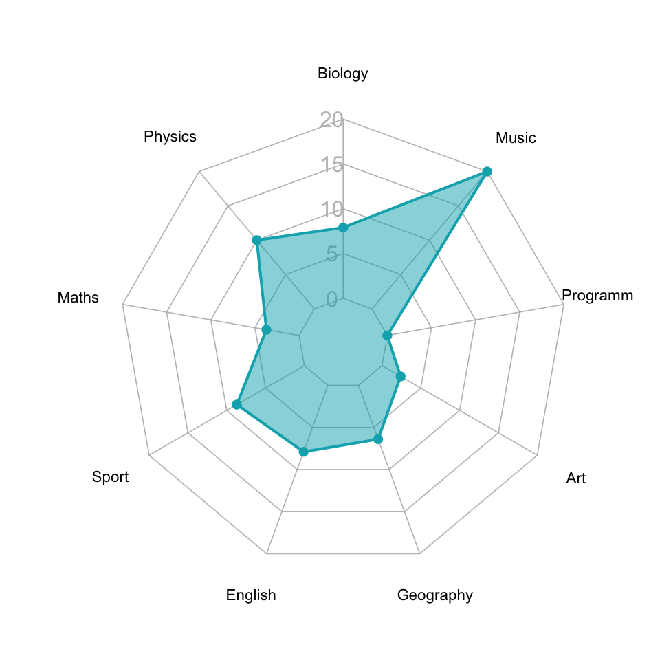
Create radar charts for multiple individuals
Create the radar chart of the three students on the same plot:
# Reduce plot margin using par()
op <- par(mar = c(1, 2, 2, 2))
# Create the radar charts
create_beautiful_radarchart(
  data = df, caxislabels = c(0, 5, 10, 15, 20),
  color = c("#00AFBB", "#E7B800", "#FC4E07")
)
# Add an horizontal legend
legend(
  x = "bottom", legend = rownames(df[-c(1,2),]), horiz = TRUE,
  bty = "n", pch = 20 , col = c("#00AFBB", "#E7B800", "#FC4E07"),
  text.col = "black", cex = 1, pt.cex = 1.5
  )
par(op)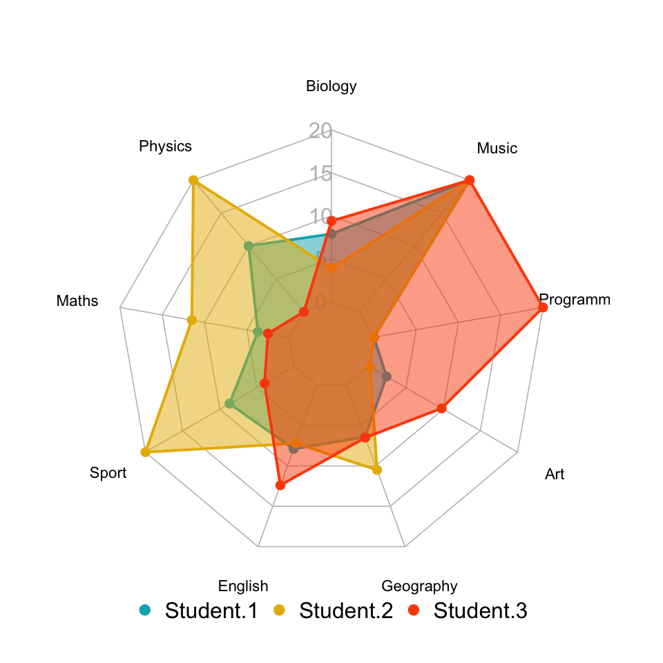
Create separated spider charts for each individual. This is recommended when you have more than 3 series.
# Define colors and titles
colors <- c("#00AFBB", "#E7B800", "#FC4E07")
titles <- c("Student.1", "Student.2", "Student.3")

# Reduce plot margin using par()
# Split the screen in 3 parts
op <- par(mar = c(1, 1, 1, 1))
par(mfrow = c(1,3))

# Create the radar chart
for(i in 1:3){
  create_beautiful_radarchart(
    data = df[c(1, 2, i+2), ], caxislabels = c(0, 5, 10, 15, 20),
    color = colors[i], title = titles[i]
    )
}
par(op)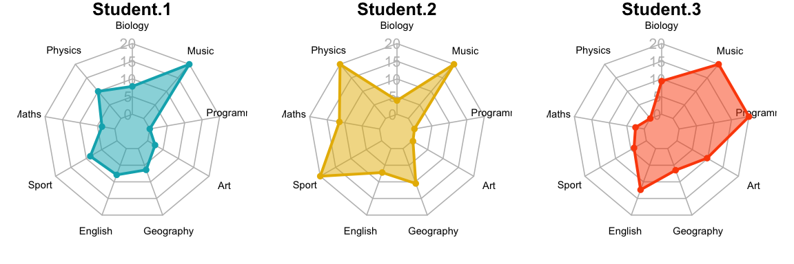
Compare every profile to an average profile
Radar charts are most useful if the profile of every individual is compared to an average profile.
- Create a demo data containing exam scores for 10 students:
set.seed(123)
df <- as.data.frame(
  matrix(sample(2:20 , 90 , replace = TRUE),
         ncol=9, byrow = TRUE)
  )
colnames(df) <- c(
  "Biology", "Physics", "Maths", "Sport", "English",
  "Geography", "Art", "Programming", "Music"
  )
rownames(df) <- paste0("Student.", 1:nrow(df))
head(df)
## Biology Physics Maths Sport English Geography Art Programming Music
## Student.1 16 20 15 4 11 19 12 6 15
## Student.2 6 20 10 4 9 8 11 10 20
## Student.3 5 15 18 12 8 13 16 11 14
## Student.4 8 10 10 11 8 7 3 6 9
## Student.5 13 14 19 2 7 16 10 16 17
## Student.6 7 12 9 8 17 18 19 18 3- Rescale each variable to range between 0 and 1:
library(scales)
df_scaled <- round(apply(df, 2, scales::rescale), 2)
df_scaled <- as.data.frame(df_scaled)
head(df_scaled)
## Biology Physics Maths Sport English Geography Art Programming Music
## Student.1 1.00 1.00 0.69 0.11 0.47 1.00 0.56 0.00 0.71
## Student.2 0.09 1.00 0.31 0.11 0.35 0.27 0.50 0.33 1.00
## Student.3 0.00 0.69 0.92 0.56 0.29 0.60 0.81 0.42 0.65
## Student.4 0.27 0.38 0.31 0.50 0.29 0.20 0.00 0.00 0.35
## Student.5 0.73 0.62 1.00 0.00 0.24 0.80 0.44 0.83 0.82
## Student.6 0.18 0.50 0.23 0.33 0.82 0.93 1.00 1.00 0.00- Prepare the data for creating the radar plot using the
fmsbpackage:
# Variables summary
# Get the minimum and the max of every column
col_max <- apply(df_scaled, 2, max)
col_min <- apply(df_scaled, 2, min)
# Calculate the average profile
col_mean <- apply(df_scaled, 2, mean)
# Put together the summary of columns
col_summary <- t(data.frame(Max = col_max, Min = col_min, Average = col_mean))


# Bind variables summary to the data
df_scaled2 <- as.data.frame(rbind(col_summary, df_scaled))
head(df_scaled2)
## Biology Physics Maths Sport English Geography Art Programming Music
## Max 1.000 1.000 1.000 1.000 1.000 1.000 1.000 1.00 1.000
## Min 0.000 0.000 0.000 0.000 0.000 0.000 0.000 0.00 0.000
## Average 0.464 0.575 0.476 0.427 0.423 0.587 0.544 0.50 0.629
## Student.1 1.000 1.000 0.690 0.110 0.470 1.000 0.560 0.00 0.710
## Student.2 0.090 1.000 0.310 0.110 0.350 0.270 0.500 0.33 1.000
## Student.3 0.000 0.690 0.920 0.560 0.290 0.600 0.810 0.42 0.650- Produce radar plots showing both the average profile and the individual profile:
opar <- par()
# Define settings for plotting in a 3x4 grid, with appropriate margins:
par(mar = rep(0.8,4))
par(mfrow = c(3,4))
# Produce a radar-chart for each student
for (i in 4:nrow(df_scaled2)) {
  radarchart(
    df_scaled2[c(1:3, i), ],
    pfcol = c("#99999980",NA),
    pcol= c(NA,2), plty = 1, plwd = 2,
    title = row.names(df_scaled2)[i]
  )
}
# Restore the standard par() settings
par <- par(opar) 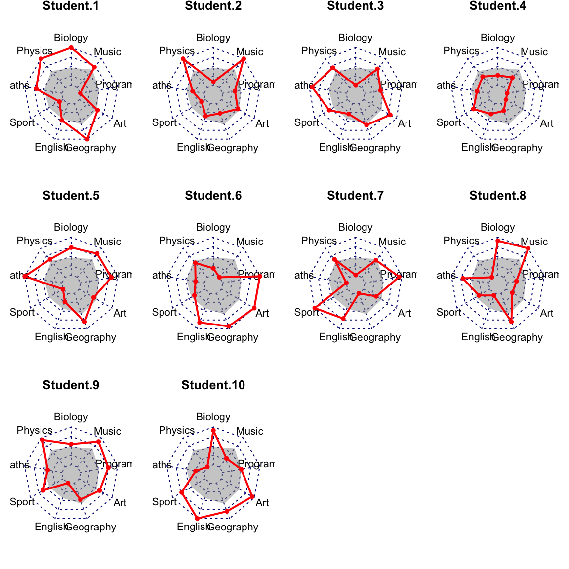
ggplot radar chart using the ggradar R package
Prerequisites
Installation:
devtools::install_github("ricardo-bion/ggradar")Loading the package:
library("ggradar")Key function and arguments
ggradar(
  plot.data, values.radar = c("0%", "50%", "100%"),
  grid.min = 0, grid.mid = 0.5, grid.max = 1,
)plot.data: data containing one row per individual or groupvalues.radar: values to show at minimum, average and maximum grid linesgrid.min: value at which minimum grid line is plottedgrid.mid: value at which average grid line is plottedgrid.max: value at which maximum grid line is plotted
Data preparation
All variables in the data should be at the same scale. If this is not the case, you need to rescale the data.
For example, you can rescale the variables to have a minimum of 0 and a maximum of 1 using the function rescale() [scales package]. We’ll describe this method in the next sections.
library(tidyverse)
# Put row names into  a column named group
df <- exam_scores %>% rownames_to_column("group")
df
## group Biology Physics Maths Sport English Geography Art Programming Music
## 1 Student.1 7.9 10 3.7 8.7 7.9 6.4 2.4 0 20
## 2 Student.2 3.9 20 11.5 20.0 7.2 10.5 0.2 0 20
## 3 Student.3 9.4 0 2.5 4.0 12.4 6.5 9.8 20 20Basic radar plot
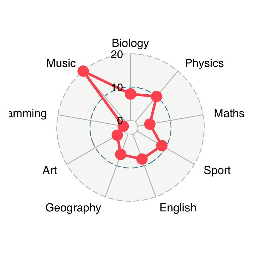
# Plotting student 1
ggradar(
  df[1, ],
  values.radar = c("0", "10", "20"),
  grid.min = 0, grid.mid = 10, grid.max = 20
  )
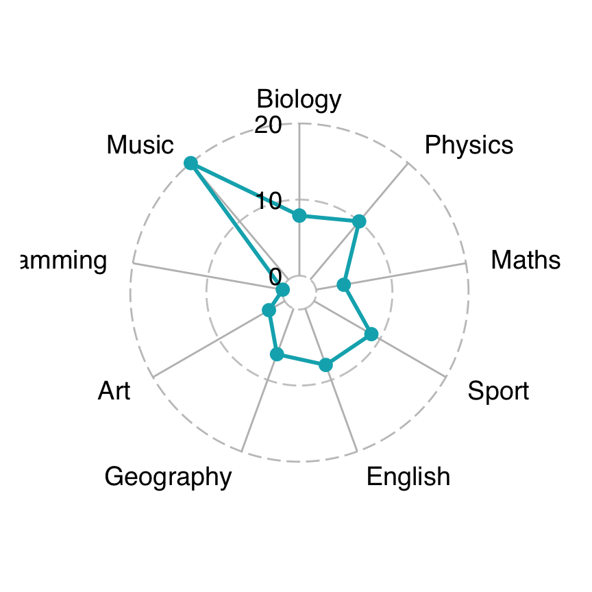
Customize radar charts
Key arguments to customize the different components of the ggplot radar chart. For more options see the documentation.
ggradar(
  df[1, ],
  values.radar = c("0", "10", "20"),
  grid.min = 0, grid.mid = 10, grid.max = 20,
  # Polygons
  group.line.width = 1,
  group.point.size = 3,
  group.colours = "#00AFBB",
  # Background and grid lines
  background.circle.colour = "white",
  gridline.mid.colour = "grey"
  )
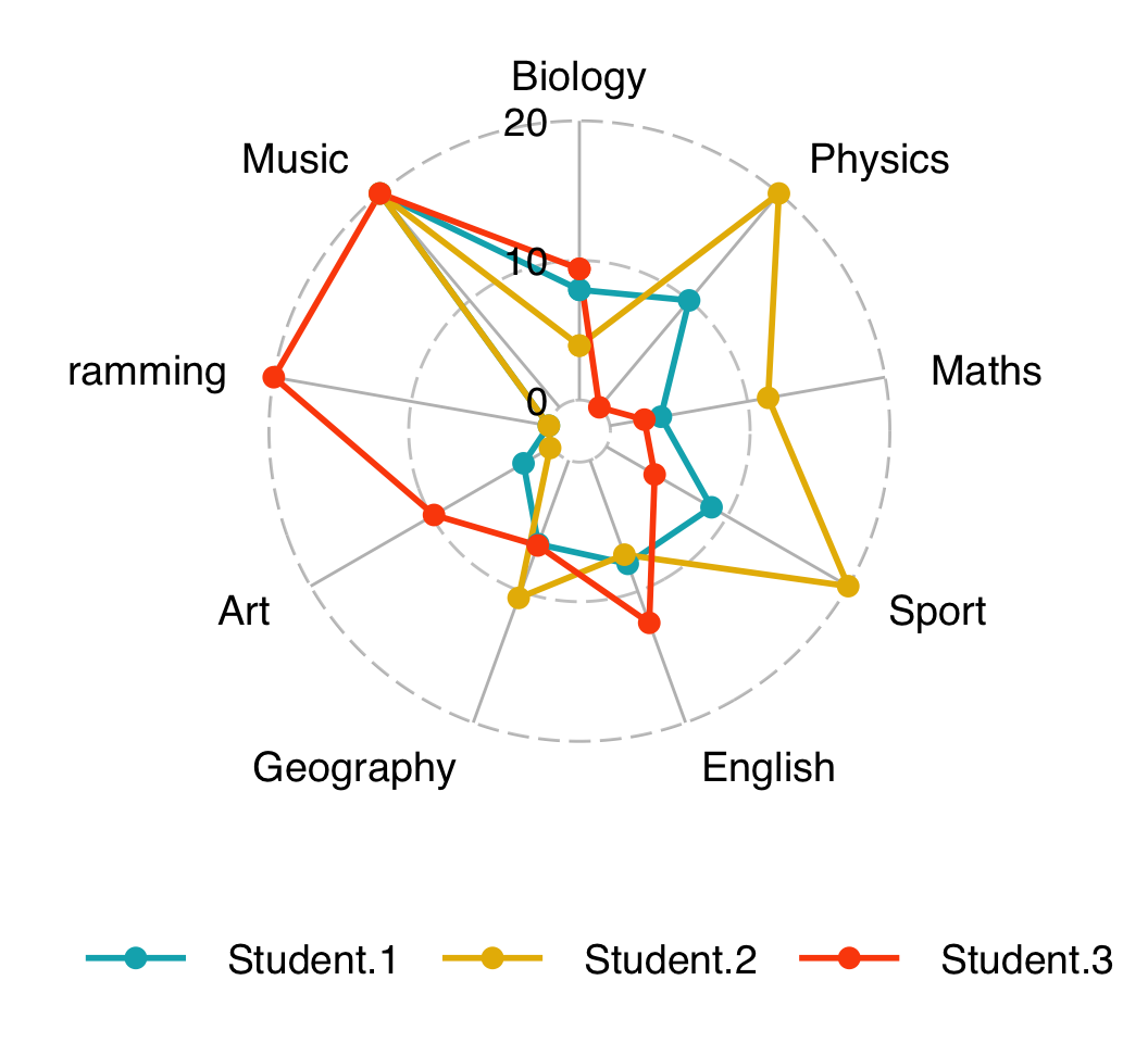
Radar chart with multiple individuals or groups
Create the radar chart of the three students on the same plot:
ggradar(
  df,
  values.radar = c("0", "10", "20"),
  grid.min = 0, grid.mid = 10, grid.max = 20,
  # Polygons
  group.line.width = 1,
  group.point.size = 3,
  group.colours = c("#00AFBB", "#E7B800", "#FC4E07"),
  # Background and grid lines
  background.circle.colour = "white",
  gridline.mid.colour = "grey",
  legend.position = "bottom"
  )
Alternatives to radar charts
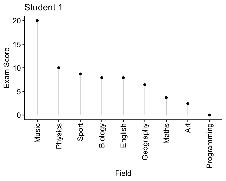
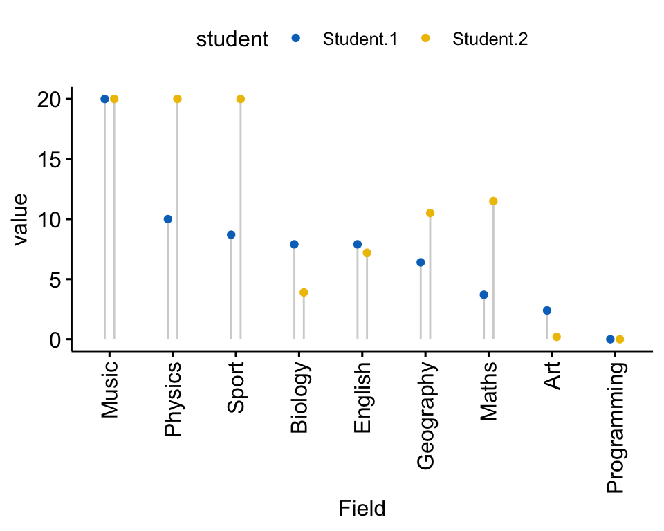
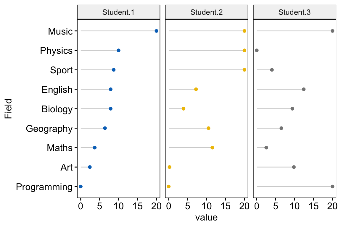
A circular plot is difficult to read. An alternative to a radar chart is an ordered lolliplot or dotchart. This section describes how to create dotcharts. The ggpubr R package will be used in this section to create a dotchart.
Load required packages:
library(tidyverse)
library(ggpubr)
Case when all quantitative variables have the same scale
Displaying one individual
Data preparation:
df2 <- t(exam_scores) %>%
  as.data.frame() %>%
  rownames_to_column("Field")
df2
## Field Student.1 Student.2 Student.3
## 1 Biology 7.9 3.9 9.4
## 2 Physics 10.0 20.0 0.0
## 3 Maths 3.7 11.5 2.5
## 4 Sport 8.7 20.0 4.0
## 5 English 7.9 7.2 12.4
## 6 Geography 6.4 10.5 6.5
## 7 Art 2.4 0.2 9.8
## 8 Programming 0.0 0.0 20.0
## 9 Music 20.0 20.0 20.0Plot creation:
ggdotchart(
  df2, x = "Field", y = "Student.1",
  add = "segments", sorting = "descending",
  ylab = "Exam Score", title = "Student 1"
  )
Displaying two individuals
Data preparation:
df3 <- df2 %>%
  select(Field, Student.1, Student.2) %>%
  pivot_longer(
    cols = c(Student.1, Student.2),
    names_to = "student",
    values_to = "value"
  )
head(df3)
## # A tibble: 6 x 3
## Field student value
## <chr> <chr> <dbl>
## 1 Biology Student.1 7.9
## 2 Biology Student.2 3.9
## 3 Physics Student.1 10
## 4 Physics Student.2 20
## 5 Maths Student.1 3.7
## 6 Maths Student.2 11.5Plot creation:
ggdotchart(
  df3, x = "Field", y = "value",
  group = "student", color = "student", palette = "jco",
  add = "segment", position = position_dodge(0.3),
  sorting = "descending"
  )
Displaying multiple individuals
Data preparation:
df4 <- df2 %>%
  select(Field, Student.1, Student.2, Student.3) %>%
  pivot_longer(
    cols = c(Student.1, Student.2, Student.3),
    names_to = "student",
    values_to = "value"
  )
head(df4)
## # A tibble: 6 x 3
## Field student value
## <chr> <chr> <dbl>
## 1 Biology Student.1 7.9
## 2 Biology Student.2 3.9
## 3 Biology Student.3 9.4
## 4 Physics Student.1 10
## 5 Physics Student.2 20
## 6 Physics Student.3 0Plot creation:
ggdotchart(
  df4, x = "Field", y = "value",
  group = "student", color = "student", palette = "jco",
  add = "segment", position = position_dodge(0.3),
  sorting = "descending", facet.by = "student",
  rotate = TRUE, legend = "none"
  )
Case when you have a lot of individuals to plot or if your variables have different scales
A solution is to create a parallel coordinates plot.
library(GGally)
ggparcoord(
  iris,
  columns = 1:4, groupColumn = 5, order = "anyClass",
  showPoints = TRUE,
  title = "Parallel Coordinate Plot for the Iris Data",
  alphaLines = 0.3
  ) +
  theme_bw() +
  theme(legend.position = "top")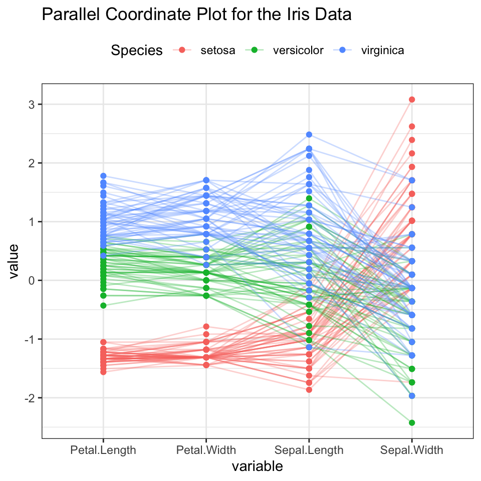
Note that, the default of the function ggparcoord() is to rescale each variable by subtracting the mean and dividing by the standard deviation.
Conclusion
This article describes how to create radar chart in R for one or multiple individuals using the fmsb package and the ggradar package (a ggplot2 extension).
Recommended for you
This section contains best data science and self-development resources to help you on your path.
Books - Data Science
Our Books
- Practical Guide to Cluster Analysis in R by A. Kassambara (Datanovia)
- Practical Guide To Principal Component Methods in R by A. Kassambara (Datanovia)
- Machine Learning Essentials: Practical Guide in R by A. Kassambara (Datanovia)
- R Graphics Essentials for Great Data Visualization by A. Kassambara (Datanovia)
- GGPlot2 Essentials for Great Data Visualization in R by A. Kassambara (Datanovia)
- Network Analysis and Visualization in R by A. Kassambara (Datanovia)
- Practical Statistics in R for Comparing Groups: Numerical Variables by A. Kassambara (Datanovia)
- Inter-Rater Reliability Essentials: Practical Guide in R by A. Kassambara (Datanovia)
Others
- R for Data Science: Import, Tidy, Transform, Visualize, and Model Data by Hadley Wickham & Garrett Grolemund
- Hands-On Machine Learning with Scikit-Learn, Keras, and TensorFlow: Concepts, Tools, and Techniques to Build Intelligent Systems by Aurelien Géron
- Practical Statistics for Data Scientists: 50 Essential Concepts by Peter Bruce & Andrew Bruce
- Hands-On Programming with R: Write Your Own Functions And Simulations by Garrett Grolemund & Hadley Wickham
- An Introduction to Statistical Learning: with Applications in R by Gareth James et al.
- Deep Learning with R by François Chollet & J.J. Allaire
- Deep Learning with Python by François Chollet
Version:
 Français


grate work
Great work , very helpful for making Radar charts!!
Love it! Is there a way to rotate the axis labels (Biology, Music, Program)?
Great examples, thanks! In your final example for the fmsb package with the grid of radars, could you please show how to output the grid to a png?
Sorry – found the answer elsewhere: https://stackoverflow.com/questions/64642436/save-radar-chart-in-r. Please ignore my comment!