This article describes how add space between the labels, on the top of the chart (bar plot, box plot, etc), and the plot border when using the ggplot2 facet functions (facet_wrap() and facet_grid()).
In the demo example, we’ll create a publication ready plot with p-values using the ggpubr package, an extension of ggplot2.
Concerning adding spaces between the labels and plot top margin, you will learn multiple solutions, such as:
- Changing the y-axis limits
- Expanding the y-axis scales using the combination of the ggplot2 functions
scale_y_continuous()andexpansion()
Contents:
Create a faceted box plot with p-values labels
library(ggpubr)
p <- ggboxplot(
   ToothGrowth, x = "supp", y = "len",
   color = "supp", palette = "jco",
   facet.by = "dose", short.panel.labs = FALSE
   ) +
   stat_compare_means(
      method = "t.test", label = "p.format",
      comparisons=list(c("OJ","VC"))
      )
p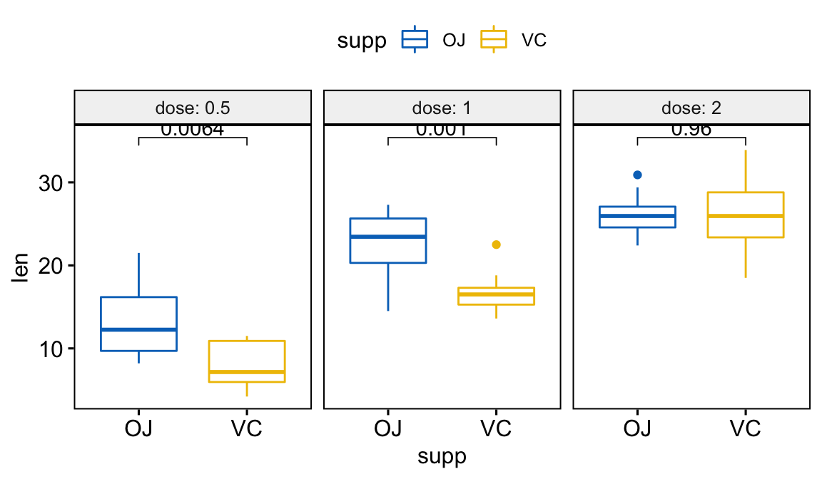
It can be seen that, p-values are not shown completely. In the next section we will show how to add more spaces between the p-value labels and the plot top border.
Solution 1: Expanding the y-axis using the ggplot2 function expansion()
Key R function:
expansion(mult = 0, add = 0)mult: vector of multiplicative range expansion factors. If length 1, both the lower and upper limits of the scale are expanded outwards by themultfactor. If length 2, the lower limit is expanded bymult[1]and the upper limit bymult[2]factors.add: vector of additive range expansion constants. If length 1, both the lower and upper limits of the scale are expanded outwards by add units. If length 2, the lower limit is expanded byadd[1]and the upper limit byadd[2]constants.
# No space below the box plots
# Add 10% space on the y-axis above the box plots
p +
   scale_y_continuous(expand = expansion(mult = c(0, 0.1)))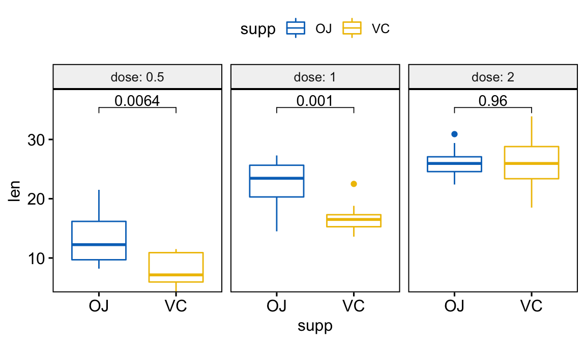
Solution 2: Using the ggplot2 function ylim()
This is only useful if the scales are similar for the different facet panels.
p + ylim (c(0, 45))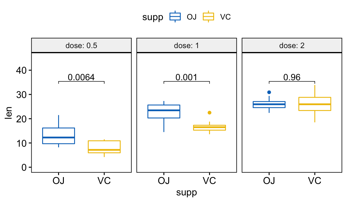
Conclusion
This article describes how to add space between labels and the ggplot top border when using the facet functions. This can be easily achieved using the combinations of scale_y_continuous() and expansion(). Note that it’s also possible to combine scale_x_continuous() and expansion() for adding spaces between data and the x-axis.
Recommended for you
This section contains best data science and self-development resources to help you on your path.
Books - Data Science
Our Books
- Practical Guide to Cluster Analysis in R by A. Kassambara (Datanovia)
- Practical Guide To Principal Component Methods in R by A. Kassambara (Datanovia)
- Machine Learning Essentials: Practical Guide in R by A. Kassambara (Datanovia)
- R Graphics Essentials for Great Data Visualization by A. Kassambara (Datanovia)
- GGPlot2 Essentials for Great Data Visualization in R by A. Kassambara (Datanovia)
- Network Analysis and Visualization in R by A. Kassambara (Datanovia)
- Practical Statistics in R for Comparing Groups: Numerical Variables by A. Kassambara (Datanovia)
- Inter-Rater Reliability Essentials: Practical Guide in R by A. Kassambara (Datanovia)
Others
- R for Data Science: Import, Tidy, Transform, Visualize, and Model Data by Hadley Wickham & Garrett Grolemund
- Hands-On Machine Learning with Scikit-Learn, Keras, and TensorFlow: Concepts, Tools, and Techniques to Build Intelligent Systems by Aurelien Géron
- Practical Statistics for Data Scientists: 50 Essential Concepts by Peter Bruce & Andrew Bruce
- Hands-On Programming with R: Write Your Own Functions And Simulations by Garrett Grolemund & Hadley Wickham
- An Introduction to Statistical Learning: with Applications in R by Gareth James et al.
- Deep Learning with R by François Chollet & J.J. Allaire
- Deep Learning with Python by François Chollet
Version:
 Français


OMG 😱 Thank you so much!! This saved my day. Amazing 👏