There are many R packages/functions for combining multiple ggplots into the same graphics. These include: gridExtra::grid.arrange() and cowplot::plot_grid.
Recently, Thomas Lin Pederson developed the patchwork R package to make very easy the creation of ggplot multiple plots
In this article, you will learn how to use the pachwork package for laying out multiple ggplots on a page.
Contents:
Related Book
GGPlot2 Essentials for Great Data Visualization in RInstallation
At the date of writing this article, pathchwork was only available in developmental version from GitHub.
You can install patchwork from github with:
if(!require(devtools)) install.packages("devtools")
devtools::install_github("thomasp85/patchwork")
Loading required R packages
Load the ggplot2 package and set the default theme to theme_bw() with the legend at the top of the plot:
library(ggplot2)
library(patchwork)
theme_set(
  theme_bw() +
    theme(legend.position = "top")
  )
Create some basic plots
The following R code creates 4 plots, including: box plot, dot plot, line plot and density plot.
# 0. Define custom color palette and prepare the data
my3cols <- c("#E7B800", "#2E9FDF", "#FC4E07")
ToothGrowth$dose <- as.factor(ToothGrowth$dose)

# 1. Create a box plot (bp)
p <- ggplot(ToothGrowth, aes(x = dose, y = len))
bxp <- p + geom_boxplot(aes(color = dose)) +
  scale_color_manual(values = my3cols)

# 2. Create a dot plot (dp)
dp <- p + geom_dotplot(aes(color = dose, fill = dose),
                       binaxis='y', stackdir='center') +
  scale_color_manual(values = my3cols) +
  scale_fill_manual(values = my3cols)

# 3. Create a line plot
lp <- ggplot(economics, aes(x = date, y = psavert)) +
  geom_line(color = "#E46726")

# 4. Density plot
dens <- ggplot(iris, aes(Sepal.Length)) +
  geom_density(aes(color = Species)) +
  scale_color_manual(values = my3cols)
Horizontal layouts
The usage of patchwork is simple: just add plots together!
bxp + dens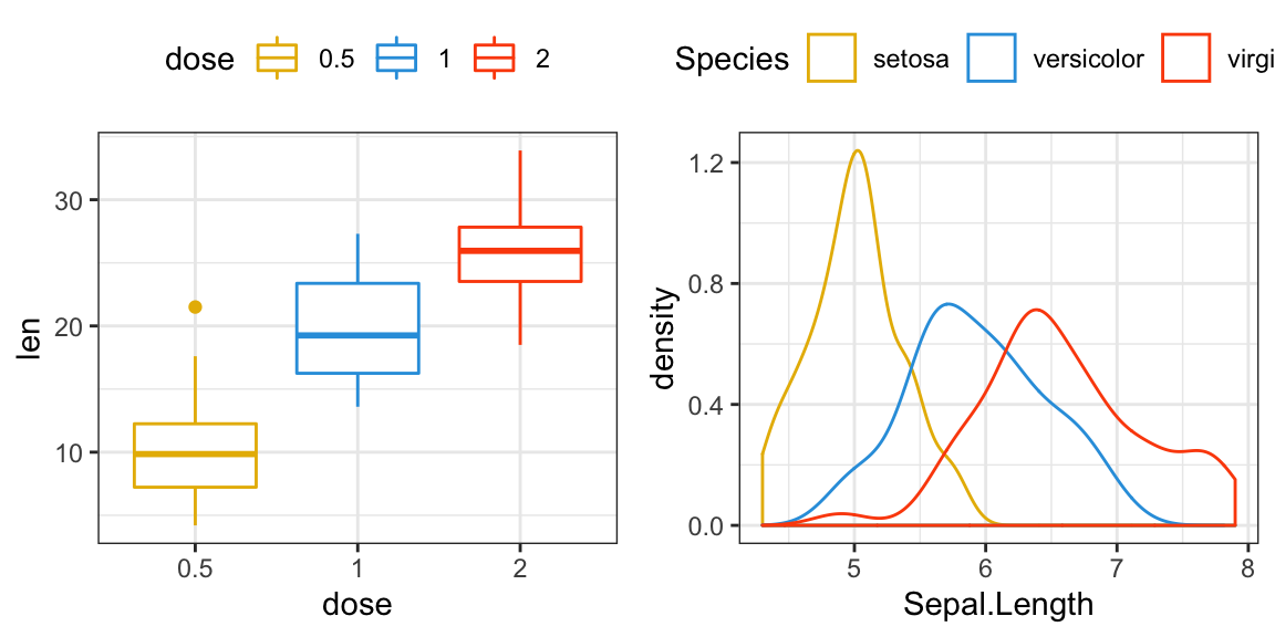
Vertical layouts
Layouts can be specified by adding a plot_layout() call to the assemble. This lets you define the dimensions of the grid and how much space to allocate to the different rows and columns.
bxp + dens + plot_layout(ncol = 1)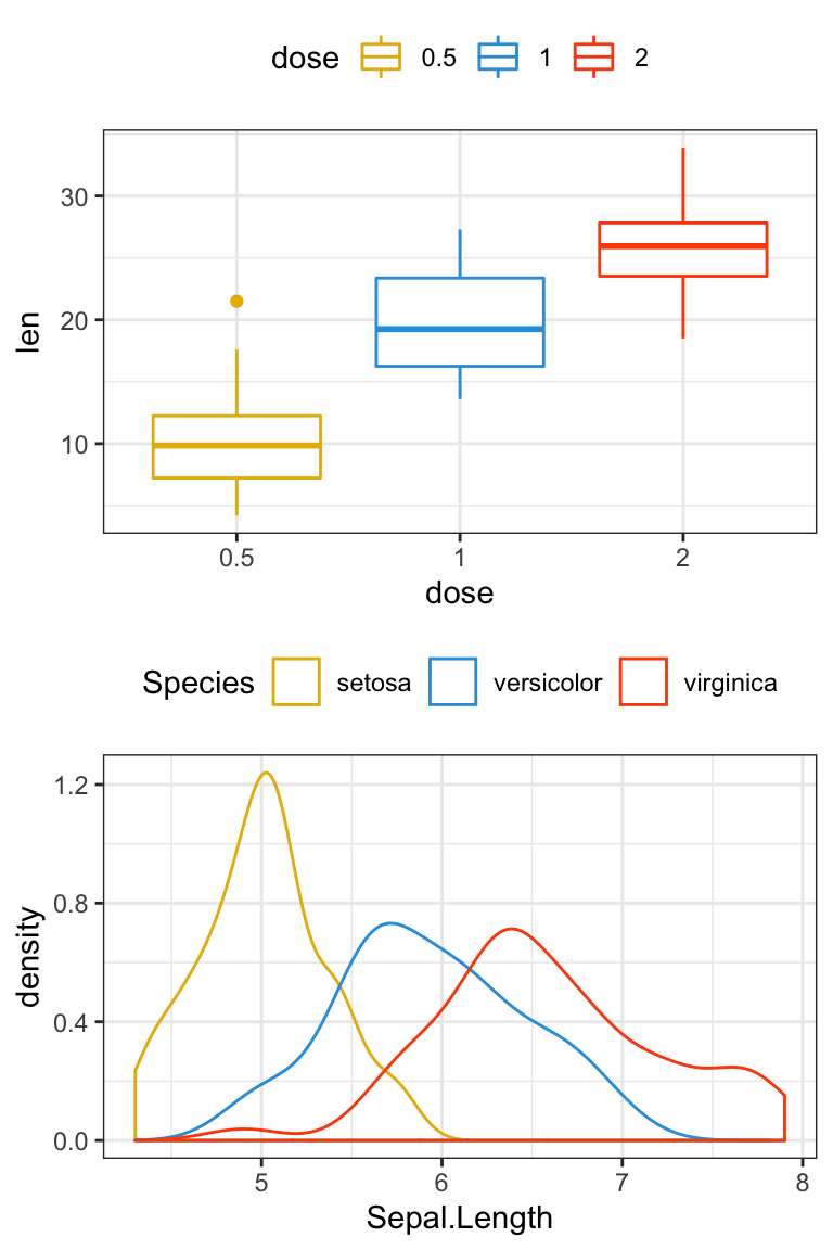
Specify the dimensions of each plot
- Change height
bxp + dens + plot_layout(ncol = 1, heights = c(1, 3))
- Change width
bxp + dens + plot_layout(ncol = 2, width = c(1, 2))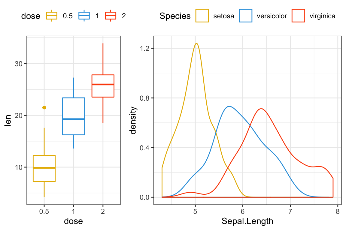
Add space between plots
bxp + plot_spacer() + dens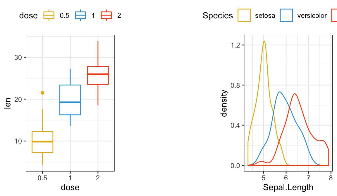
Nested layouts
You can make nested plots layout by wrapping part of the plots in parentheses - in these cases the layout is scoped to the different nesting levels.
lp + {
  dens + {
    bxp +
    dp +
    plot_layout(ncol = 1)
  }
} +
  plot_layout(ncol = 1)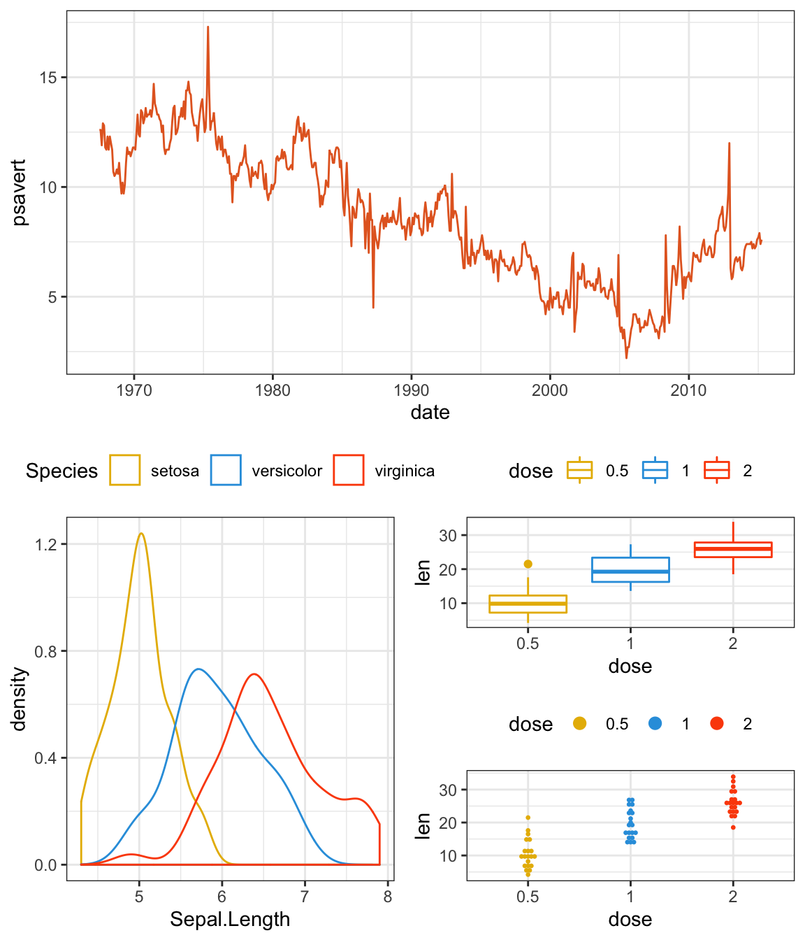
Advanced features
patchwork provides some other operators that might be of interest: - will behave like + but put the left and right side in the same nesting level (as opposed to putting the right side into the left sides nesting level).
bxp + dp - lp + plot_layout(ncol = 1)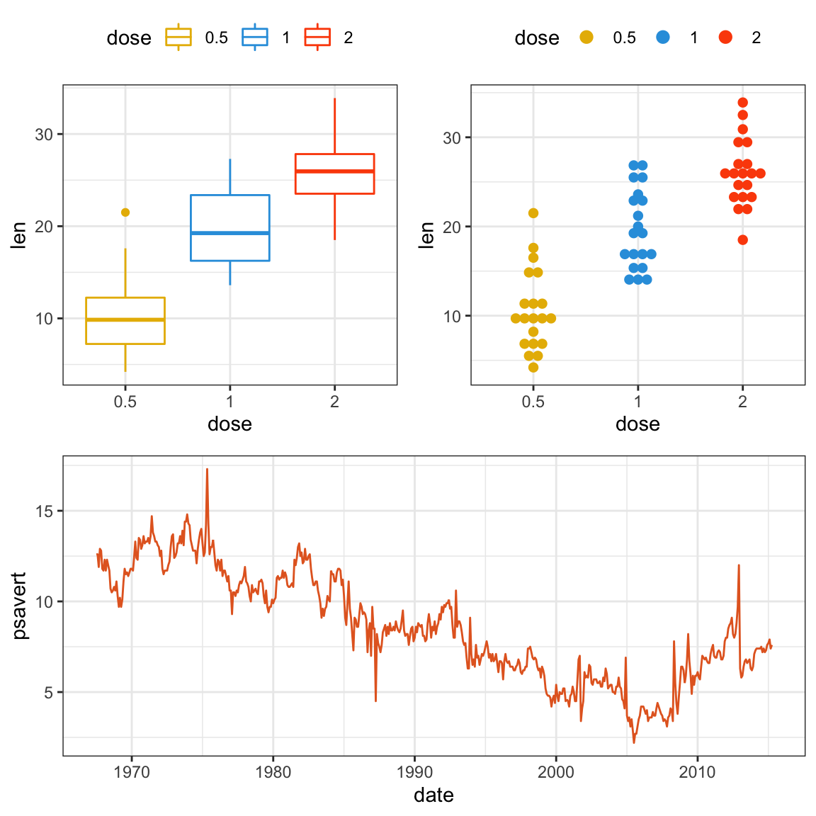
It can be seen that bxp + dens and lp is on the same level…
A note on semantics. If - is read as subtract its use makes little sense as we are not removing plots. Think of it as a hyphen instead…
Often you are interested in just putting plots besides or on top of each other. patchwork provides both | and / for horizontal and vertical layouts respectively. They can of course be combined for a very readable layout syntax:
(bxp | lp | dp) / dens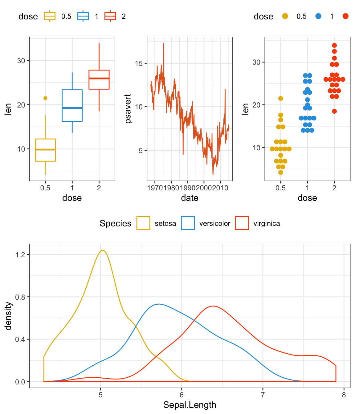
(bxp | lp ) / (dp | dens)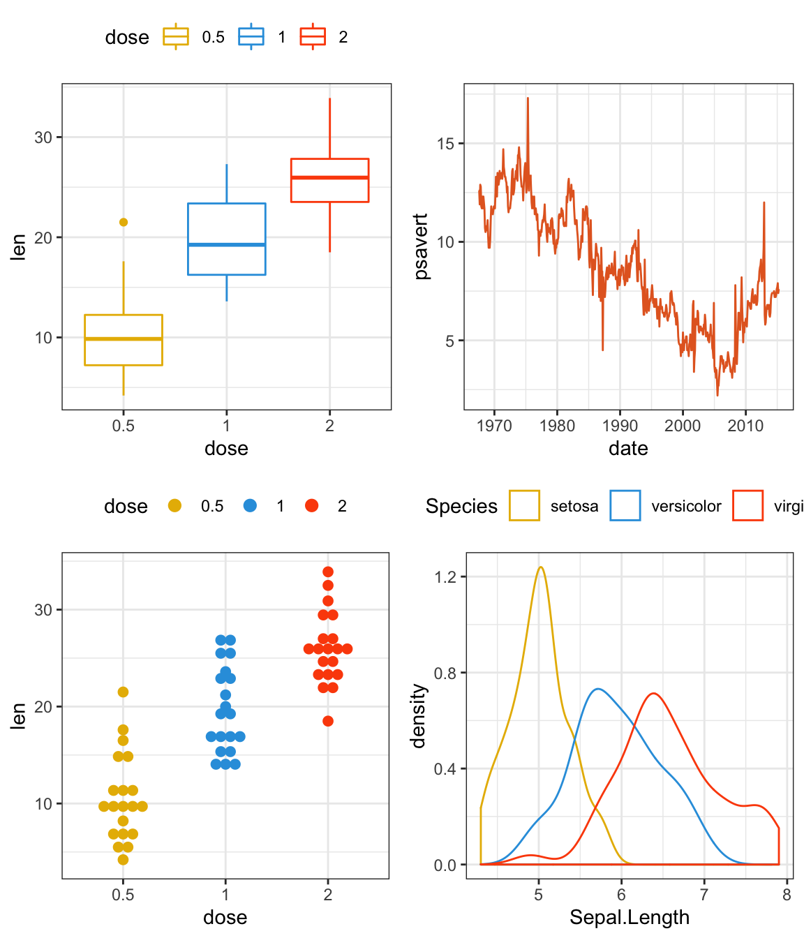
(bxp / lp / dp) | dens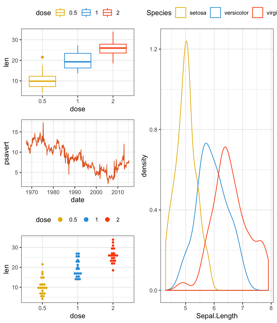
There are two additional operators that are used for a slightly different purpose, namely to reduce code repetition. Consider the case where you want to change the theme for all plots in an assemble.
Instead of modifying all plots individually you can use & or * to add elements to all subplots. The two differ in that * will only affect the plots on the current nesting level:
(bxp + (dp + dens) + lp + plot_layout(ncol = 1)) * theme_gray()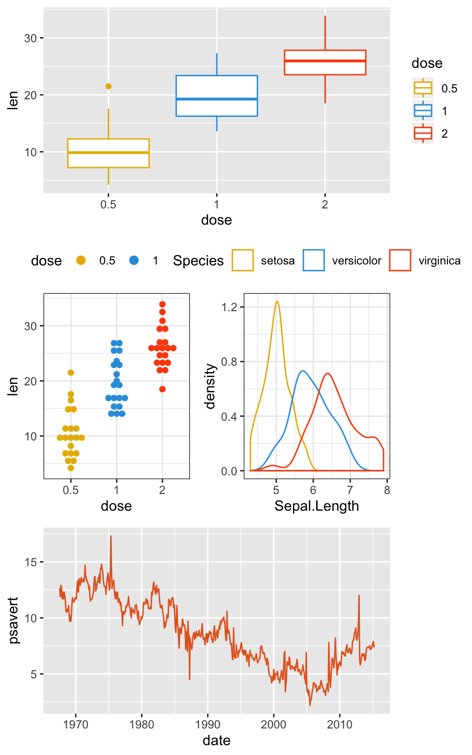
whereas & will recurse into nested levels:
(bxp + (dp + dens) + lp + plot_layout(ncol = 1)) & theme_gray()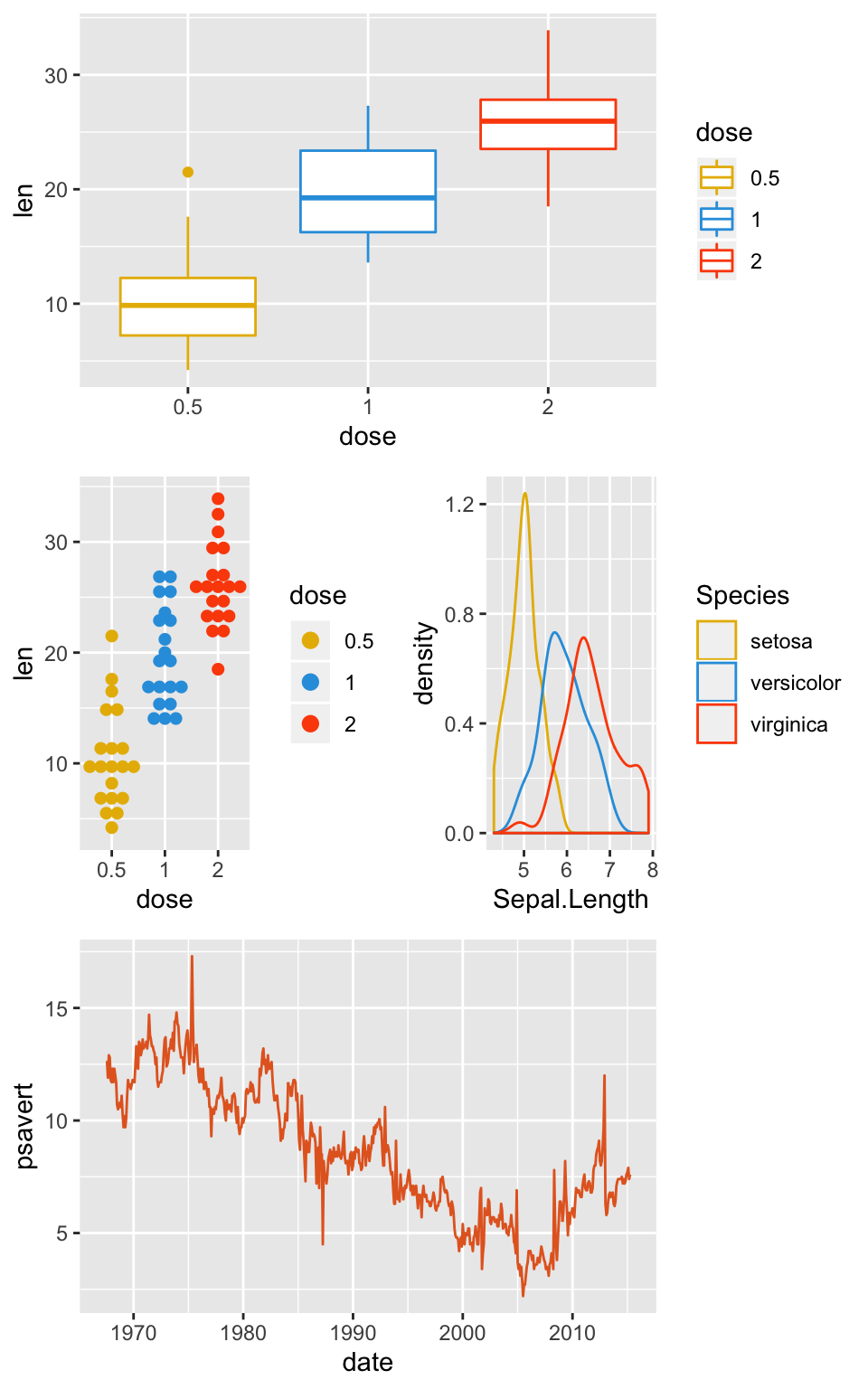
Note that parenthesis is required in the former case due to higher precedence of the * operator. The latter case is the most common so it has deserved the easiest use.
Reference
Recommended for you
This section contains best data science and self-development resources to help you on your path.
Books - Data Science
Our Books
- Practical Guide to Cluster Analysis in R by A. Kassambara (Datanovia)
- Practical Guide To Principal Component Methods in R by A. Kassambara (Datanovia)
- Machine Learning Essentials: Practical Guide in R by A. Kassambara (Datanovia)
- R Graphics Essentials for Great Data Visualization by A. Kassambara (Datanovia)
- GGPlot2 Essentials for Great Data Visualization in R by A. Kassambara (Datanovia)
- Network Analysis and Visualization in R by A. Kassambara (Datanovia)
- Practical Statistics in R for Comparing Groups: Numerical Variables by A. Kassambara (Datanovia)
- Inter-Rater Reliability Essentials: Practical Guide in R by A. Kassambara (Datanovia)
Others
- R for Data Science: Import, Tidy, Transform, Visualize, and Model Data by Hadley Wickham & Garrett Grolemund
- Hands-On Machine Learning with Scikit-Learn, Keras, and TensorFlow: Concepts, Tools, and Techniques to Build Intelligent Systems by Aurelien Géron
- Practical Statistics for Data Scientists: 50 Essential Concepts by Peter Bruce & Andrew Bruce
- Hands-On Programming with R: Write Your Own Functions And Simulations by Garrett Grolemund & Hadley Wickham
- An Introduction to Statistical Learning: with Applications in R by Gareth James et al.
- Deep Learning with R by François Chollet & J.J. Allaire
- Deep Learning with Python by François Chollet
Version:
 Français


Is there any way to label each plot (A, B, C) automatically, to create a publishable-ready figure?…
It’s possible to use the option tag in the function labs() for adding label to each plot.
For example, kindly try this: