This article describes how to compute and automatically add p-values onto ggplot facets using the ggpubr and the rstatix R packages.
You will learn how to:
- Add p-values to a multipanel facet plots containing two or more groups by panel. Examples are shown for box plots and bar plots.
- Add p-values to a faceted grouped plots (box plots and bar plots). Examples, containing three groups by x position, are shown.
- Display the p-values combined with the significance levels onto the plots
We will follow the steps below for adding significance levels onto a ggplot:
- Compute easily statistical tests (
t_test()orwilcox_test()) using therstatixpackage - Auto-compute p-value label positions using the function
add_xy_position()[in rstatix package]. - Add the p-values to the plot using the function
stat_pvalue_manual()[in ggpubr package]. The following key options are illustrated in some of the examples:- The option
bracket.nudge.yis used to move up or to move down the brackets. - The option
step.increaseis used to add more space between brackets. - The option
vjustis used to vertically adjust the position of the p-values labels
- The option
Note that, in some situations, the p-value labels are partially hidden by the plot top border. In these cases, the ggplot2 function scale_y_continuous(expand = expansion(mult = c(0, 0.1))) can be used to add more spaces between labels and the plot top border. The option mult = c(0, 0.1) indicates that 0% and 10% spaces are respectively added at the bottom and the top of the plot.
Contents:
Prerequisites
Make sure you have installed the following R packages:
tidyversefor data manipulation and visualizationggpubrfor creating easily publication ready plotsrstatixprovides pipe-friendly R functions for easy statistical analyses.
Start by loading the following required packages:
library(ggpubr)
library(rstatix)
Data preparation
# Transform `dose` into factor variable
df <- ToothGrowth
df$dose <- as.factor(df$dose)
# Add a random grouping variable
df$group <- factor(rep(c("grp1", "grp2"), 30))
head(df, 3)
## len supp dose group
## 1 4.2 VC 0.5 grp1
## 2 11.5 VC 0.5 grp2
## 3 7.3 VC 0.5 grp1Multipanel plots containing two groups by panel
Facet wrap by one variable
Statistical tests
Facet by the dose variable and compare the levels of the supp variable on the x-axis.
stat.test <- df %>%
  group_by(dose) %>%
  t_test(len ~ supp) %>%
  adjust_pvalue(method = "bonferroni") %>%
  add_significance()
stat.test
## # A tibble: 3 x 11
## dose .y. group1 group2 n1 n2 statistic df p p.adj p.adj.signif
## <fct> <chr> <chr> <chr> <int> <int> <dbl> <dbl> <dbl> <dbl> <chr>
## 1 0.5 len OJ VC 10 10 3.17 15.0 0.00636 0.0191 *
## 2 1 len OJ VC 10 10 4.03 15.4 0.00104 0.00312 **
## 3 2 len OJ VC 10 10 -0.0461 14.0 0.964 1 nsBox plots
# Create a box plot
bxp <- ggboxplot(
  df, x = "supp", y = "len", fill = "#00AFBB",
  facet.by = "dose"
  )

# Make facet and add p-values
stat.test <- stat.test %>% add_xy_position(x = "supp")
bxp + stat_pvalue_manual(stat.test)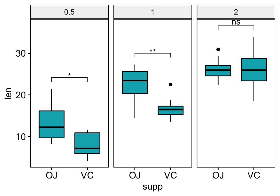
# Make the facet scale free and add jitter points
# Move down the bracket using `bracket.nudge.y`
# Hide ns (non-significant)
# Show adjusted p-values and significance levels
# Add 10% spaces between the p-value labels and the plot border
bxp <- ggboxplot(
  df, x = "supp", y = "len", fill = "#00AFBB",
  facet.by = "dose", scales = "free", add = "jitter"
  )
bxp +
  stat_pvalue_manual(
    stat.test, bracket.nudge.y = -2, hide.ns = TRUE,
    label = "{p.adj}{p.adj.signif}"
    ) +
  scale_y_continuous(expand = expansion(mult = c(0.05, 0.1)))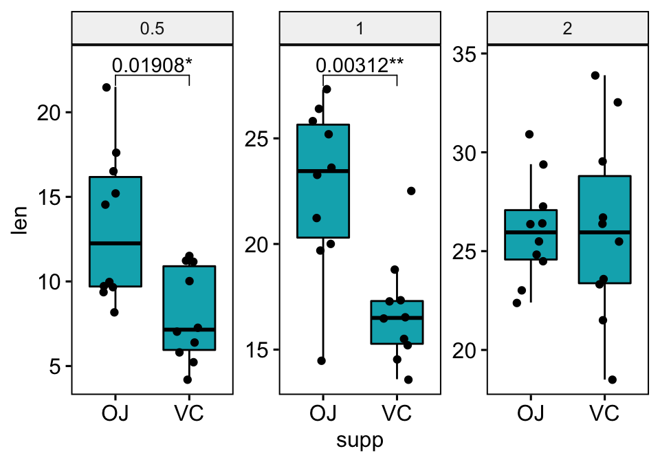
Bar plots
The option add = "mean_sd" is specified in the bar plot function for creating bar plot with error bars (mean +/- SD). You need to specify the same summary statistics function to auto-compute p-value labels positions in add_xy_position() using the option fun.
# Create a bar plot with error bars (mean +/- sd)
bp <- ggbarplot(
  df, x = "supp", y = "len", add = "mean_sd",
  fill = "#00AFBB", facet.by = "dose"
  )

# Add p-values onto the bar plots
stat.test <- stat.test %>% add_xy_position(fun = "mean_sd", x = "supp")
bp + stat_pvalue_manual(stat.test)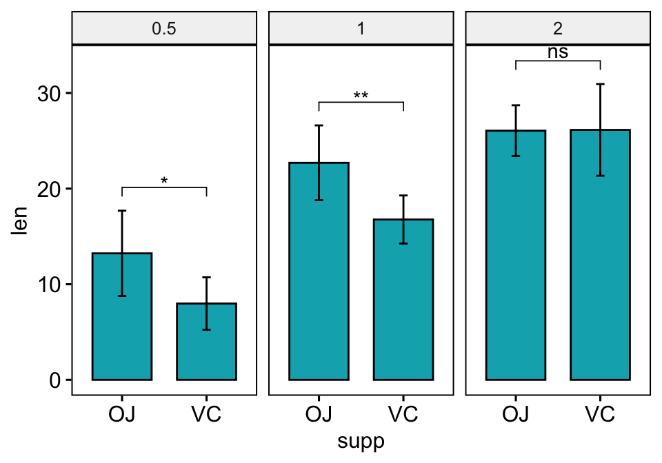
Bar plots with jitter points
You need to specify fun = "max" when computing the p-value labels positions, so that the first bracket will start at the maximum of the data points. This avoids the overlap between data points and brackets.
# Create a bar plot with error bars (mean +/- sd)
bp <- ggbarplot(
  df, x = "supp", y = "len", add = c("mean_sd", "jitter"),
  fill = "#00AFBB", facet.by = "dose"
  )

# Add p-values onto the bar plots
stat.test <- stat.test %>% add_xy_position(fun = "max", x = "supp")
bp + stat_pvalue_manual(stat.test)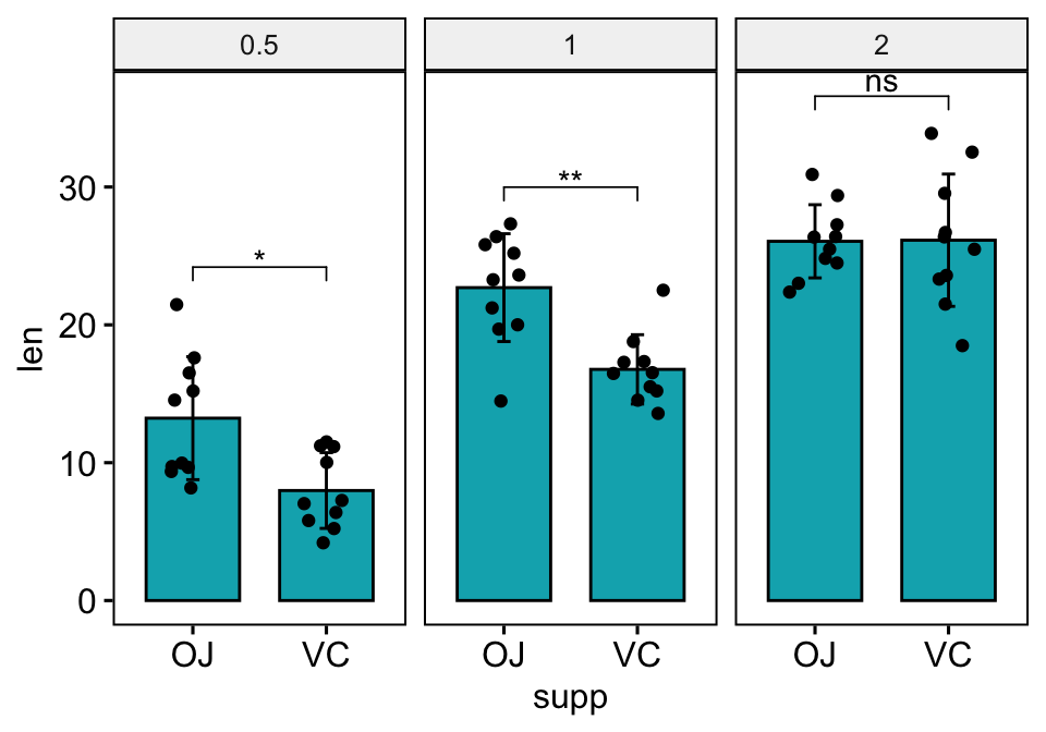
Facet grid by two variables
Statistical test
Facet by the dose and group variables, and compare the levels of the supp variable on the x-axis.
stat.test <- df %>%
  group_by(group, dose) %>%
  t_test(len ~ supp) %>%
  adjust_pvalue(method = "bonferroni") %>%
  add_significance()
stat.test
## # A tibble: 6 x 12
## dose group .y. group1 group2 n1 n2 statistic df p p.adj p.adj.signif
## <fct> <fct> <chr> <chr> <chr> <int> <int> <dbl> <dbl> <dbl> <dbl> <chr>
## 1 0.5 grp1 len OJ VC 5 5 3.71 7.35 0.00697 0.0418 *
## 2 1 grp1 len OJ VC 5 5 1.37 7.65 0.208 1 ns
## 3 2 grp1 len OJ VC 5 5 -0.485 6.52 0.643 1 ns
## 4 0.5 grp2 len OJ VC 5 5 1.13 5.79 0.304 1 ns
## 5 1 grp2 len OJ VC 5 5 6.91 5.84 0.00051 0.00306 **
## 6 2 grp2 len OJ VC 5 5 0.319 6.07 0.76 1 nsBox plots
# Create box plots with significance levels
# Hide ns (non-significant)
stat.test <- stat.test %>% add_xy_position(x = "supp")
ggboxplot(
  df, x = "supp", y = "len", fill = "#E7B800",
  facet = c("group", "dose")
  ) +
  stat_pvalue_manual(stat.test, hide.ns = TRUE)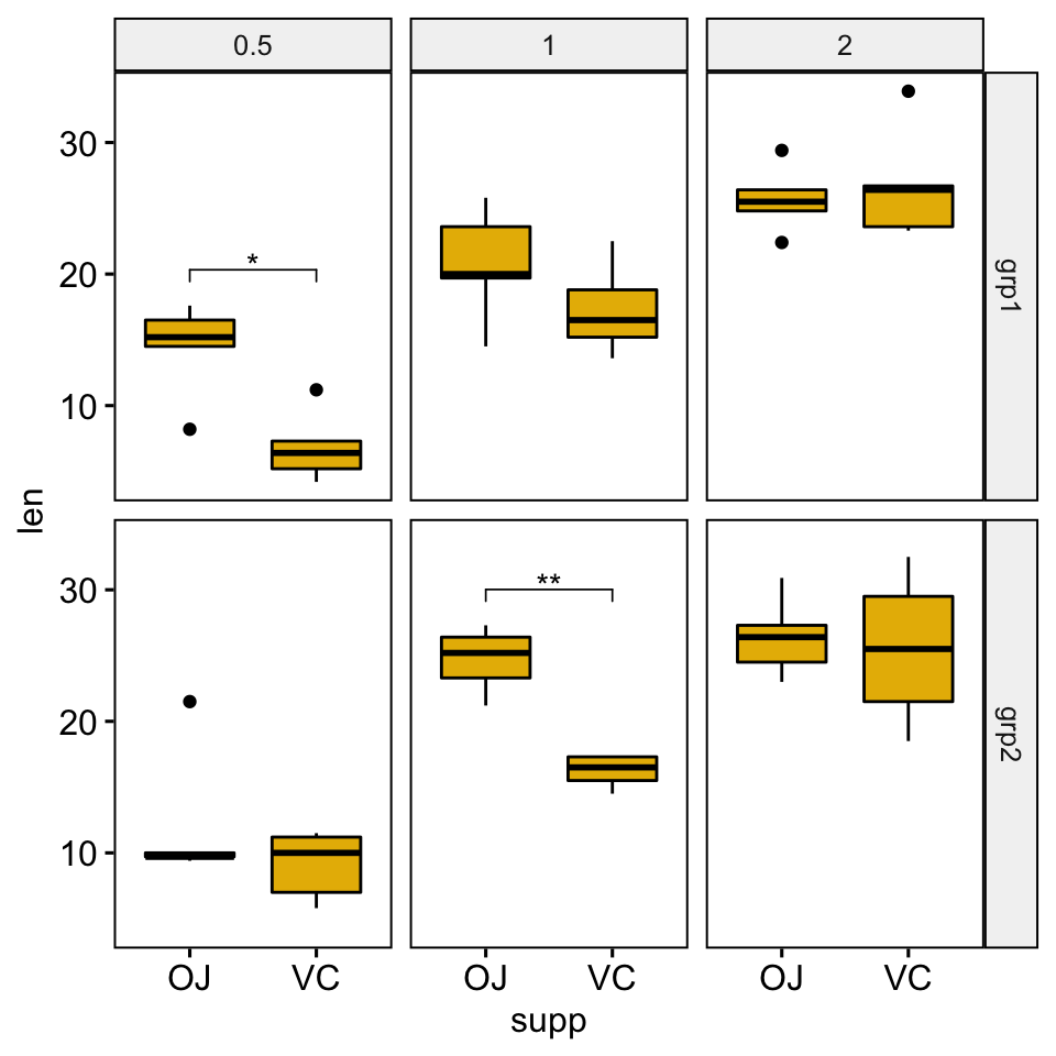
Bar plots
# Create bar plots with significance levels
# Hide ns (non-significant)
stat.test <- stat.test %>% add_xy_position(x = "supp", fun = "mean_sd")
ggbarplot(
  df, x = "supp", y = "len", fill = "#E7B800",
  add = c("mean_sd", "jitter"), facet = c("group", "dose")
  ) +
  stat_pvalue_manual(stat.test, hide.ns = TRUE)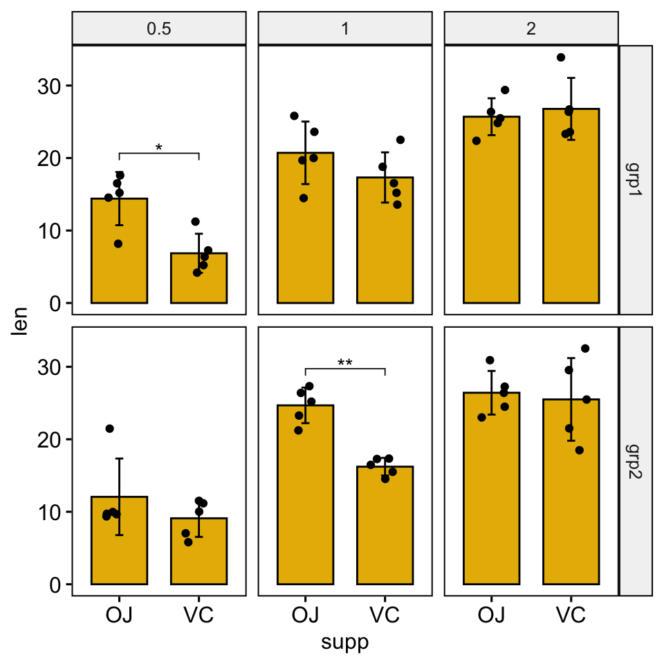
Multipanel plots containing three or more groups by panel
Facet wrap by one variable
Perform all pairwise comparisons
Group by the supp variable and then perform pairwise comparisons between the levels of dose variable.
Statistical test:
stat.test <- df %>%
  group_by(supp) %>%
  t_test(len ~ dose)
stat.test
## # A tibble: 6 x 11
## supp .y. group1 group2 n1 n2 statistic df p p.adj p.adj.signif
## * <fct> <chr> <chr> <chr> <int> <int> <dbl> <dbl> <dbl> <dbl> <chr>
## 1 OJ len 0.5 1 10 10 -5.05 17.7 0.0000878 0.000176 ***
## 2 OJ len 0.5 2 10 10 -7.82 14.7 0.00000132 0.00000396 ****
## 3 OJ len 1 2 10 10 -2.25 15.8 0.039 0.039 *
## 4 VC len 0.5 1 10 10 -7.46 17.9 0.000000681 0.00000136 ****
## 5 VC len 0.5 2 10 10 -10.4 14.3 0.0000000468 0.00000014 ****
## 6 VC len 1 2 10 10 -5.47 13.6 0.0000916 0.0000916 ****Add the p-values onto the plots. The ggplot2 function scale_y_continuous(expand = expansion(mult = c(0, 0.1))) is used to add more spaces between labels and the plot top border
# Box plots with p-values
stat.test <- stat.test %>% add_y_position()
ggboxplot(df, x = "dose", y = "len", fill = "#FC4E07", facet.by = "supp") +
  stat_pvalue_manual(stat.test, label = "p.adj.signif", tip.length = 0.01) +
  scale_y_continuous(expand = expansion(mult = c(0.05, 0.1)))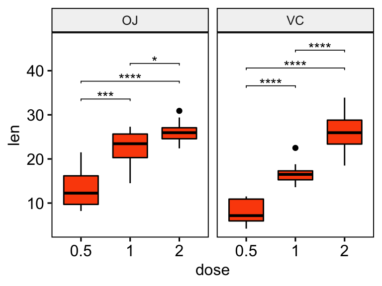
# Bar plot with p-values
# Add 10% space on the y-axis above the box plots
stat.test <- stat.test %>% add_y_position(fun = "mean_sd")
ggbarplot(
  df, x = "dose", y = "len", fill = "#FC4E07",
  add = "mean_sd", facet.by = "supp"
  ) +
  stat_pvalue_manual(stat.test,  label = "p.adj.signif", tip.length = 0.01) +
  scale_y_continuous(expand = expansion(mult = c(0.05, 0.1)))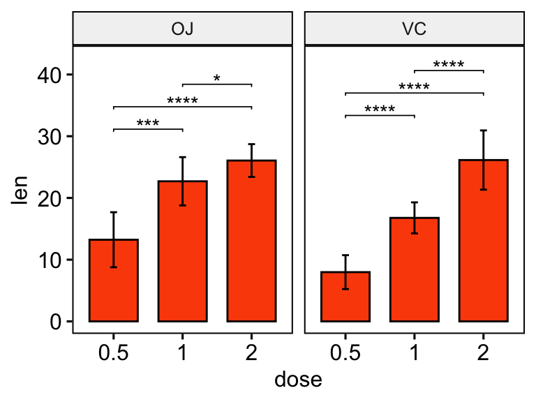
Pairwise comparisons against a reference group
Statistical test:
stat.test <- df %>%
  group_by(supp) %>%
  t_test(len ~ dose, ref.group = "0.5")
stat.test
## # A tibble: 4 x 11
## supp .y. group1 group2 n1 n2 statistic df p p.adj p.adj.signif
## * <fct> <chr> <chr> <chr> <int> <int> <dbl> <dbl> <dbl> <dbl> <chr>
## 1 OJ len 0.5 1 10 10 -5.05 17.7 0.0000878 0.0000878 ****
## 2 OJ len 0.5 2 10 10 -7.82 14.7 0.00000132 0.00000264 ****
## 3 VC len 0.5 1 10 10 -7.46 17.9 0.000000681 0.000000681 ****
## 4 VC len 0.5 2 10 10 -10.4 14.3 0.0000000468 0.0000000936 ****# Box plots with p-values
stat.test <- stat.test %>% add_y_position()
ggboxplot(df, x = "dose", y = "len", fill = "#FC4E07", facet.by = "supp") +
stat_pvalue_manual(stat.test, label = "p.adj.signif", tip.length = 0.01) +
scale_y_continuous(expand = expansion(mult = c(0.05, 0.1)))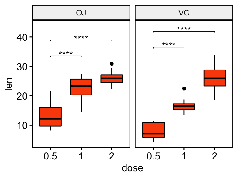
# Show only significance levels at x = group2
# Move down significance symbols using vjust
stat.test <- stat.test %>% add_y_position()
ggboxplot(df, x = "dose", y = "len", fill = "#FC4E07", facet.by = "supp") +
stat_pvalue_manual(stat.test, label = "p.adj.signif", x = "group2", vjust = 2) 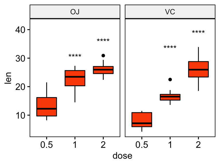
# Bar plot with p-values
# Add 10% space on the y-axis above the box plots
stat.test <- stat.test %>% add_y_position(fun = "mean_sd")
ggbarplot(
  df, x = "dose", y = "len", fill = "#FC4E07",
  add = c("mean_sd", "jitter"), facet.by = "supp"
  ) +
  stat_pvalue_manual(stat.test,  label = "p.adj.signif", tip.length = 0.01) +
  scale_y_continuous(expand = expansion(mult = c(0.05, 0.1)))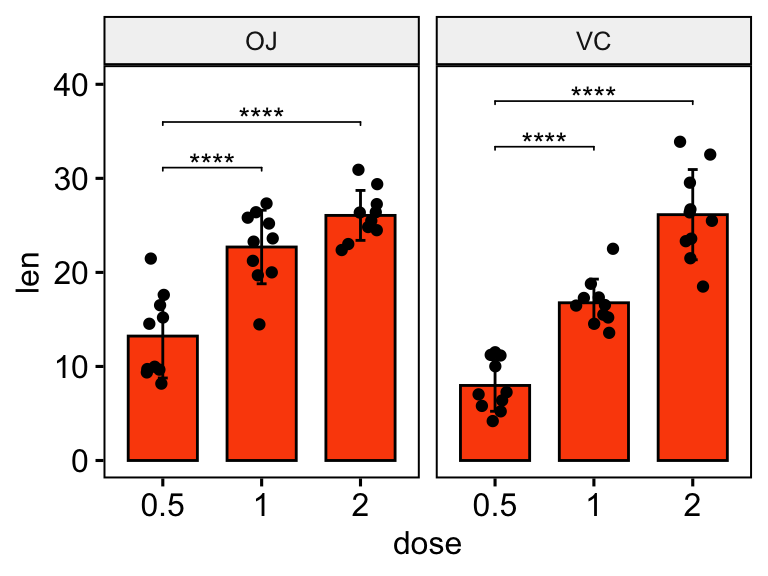
Facet grid by two variables
Statistical test
Facet by the supp and group variables, and compare the levels of the dose variable on the x-axis.
stat.test <- df %>%
  group_by(group, supp) %>%
  t_test(len ~ dose) %>%
  adjust_pvalue(method = "bonferroni") %>%
  add_significance()
stat.test
## # A tibble: 12 x 12
## supp group .y. group1 group2 n1 n2 statistic df p p.adj p.adj.signif
## <fct> <fct> <chr> <chr> <chr> <int> <int> <dbl> <dbl> <dbl> <dbl> <chr>
## 1 OJ grp1 len 0.5 1 5 5 -2.50 7.80 0.038 0.456 ns
## 2 OJ grp1 len 0.5 2 5 5 -5.66 7.13 0.000717 0.00860 **
## 3 OJ grp1 len 1 2 5 5 -2.22 6.49 0.064 0.768 ns
## 4 VC grp1 len 0.5 1 5 5 -5.33 7.54 0.000855 0.0103 *
## 5 VC grp1 len 0.5 2 5 5 -8.81 6.75 0.0000606 0.000727 ***
## 6 VC grp1 len 1 2 5 5 -3.84 7.67 0.005 0.06 ns
## # … with 6 more rowsBox plots
# Create box plots with significance levels
# Hide ns (non-significant)
# Add 15% space between labels and the plot top border
stat.test <- stat.test %>% add_xy_position(x = "dose")
ggboxplot(
  df, x = "dose", y = "len", fill = "#FC4E07",
  facet = c("group", "supp")
  ) +
  stat_pvalue_manual(stat.test, hide.ns = TRUE) +
  scale_y_continuous(expand = expansion(mult = c(0.05, 0.15)))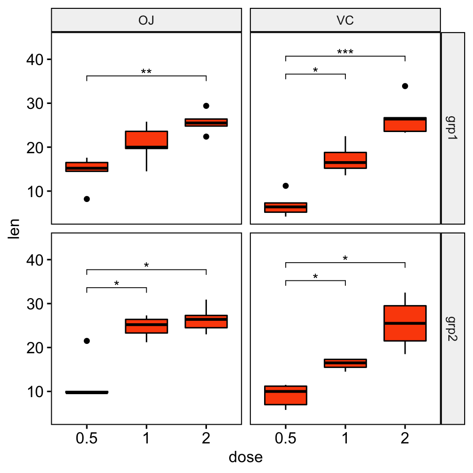
Bar plots
# Create bar plots with significance levels
# Hide ns (non-significant)
# Add 15% space between labels and the plot top border
stat.test <- stat.test %>% add_xy_position(x = "dose", fun = "mean_sd")
ggbarplot(
  df, x = "dose", y = "len", fill = "#FC4E07",
  add = c("mean_sd", "jitter"), facet = c("group", "supp")
  ) +
  stat_pvalue_manual(stat.test, hide.ns = TRUE) +
  scale_y_continuous(expand = expansion(mult = c(0.05, 0.15)))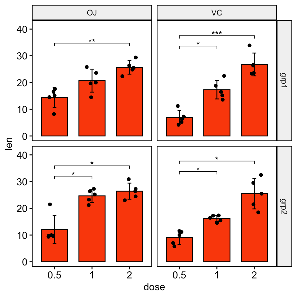
Faceted grouped plots
Simple plots
# Box plots
bxp <- ggboxplot(
  df, x = "supp", y = "len", color = "dose",
   palette = "jco", facet.by = "group"
  )
bxp 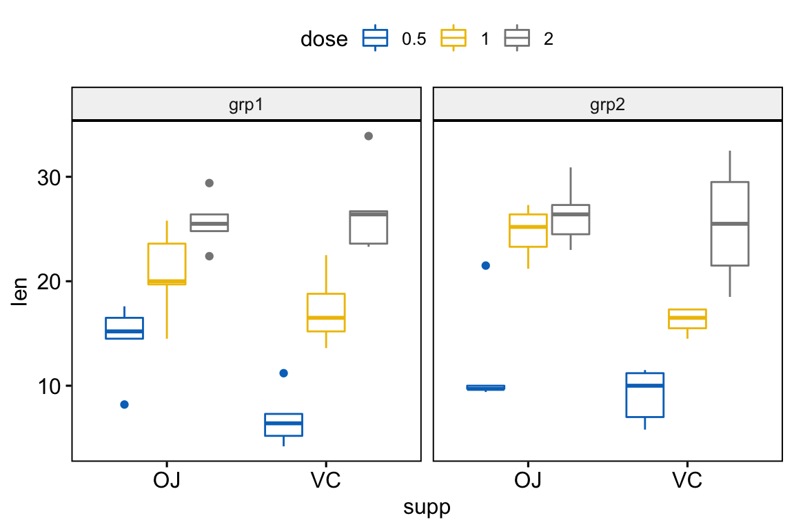
# Bar plots
bp <- ggbarplot(
  df, x = "supp", y = "len", color = "dose",
  palette = "jco", add = "mean_sd",
  position = position_dodge(0.8),
  facet.by = "group"
  )
bp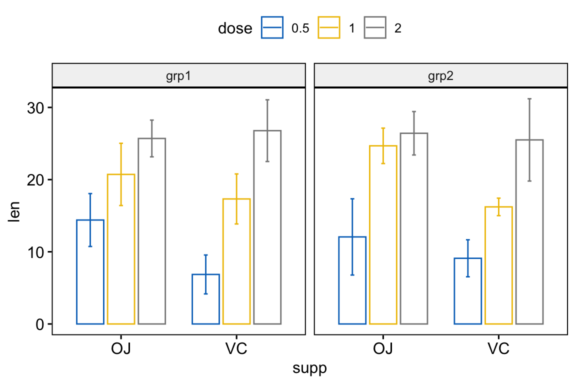
Perform all pairwise comparisons
Statistical test:
stat.test <- df %>%
  group_by(supp, group) %>%
  t_test(len ~ dose)
stat.test
## # A tibble: 12 x 12
## supp group .y. group1 group2 n1 n2 statistic df p p.adj p.adj.signif
## * <fct> <fct> <chr> <chr> <chr> <int> <int> <dbl> <dbl> <dbl> <dbl> <chr>
## 1 OJ grp1 len 0.5 1 5 5 -2.50 7.80 0.038 0.076 ns
## 2 OJ grp1 len 0.5 2 5 5 -5.66 7.13 0.000717 0.002 **
## 3 OJ grp1 len 1 2 5 5 -2.22 6.49 0.064 0.076 ns
## 4 OJ grp2 len 0.5 1 5 5 -4.85 5.65 0.003 0.007 **
## 5 OJ grp2 len 0.5 2 5 5 -5.28 6.35 0.002 0.005 **
## 6 OJ grp2 len 1 2 5 5 -1.00 7.69 0.347 0.347 ns
## # … with 6 more rowsAdd p-values onto the plots:
# Box plots with p-values
# Hide ns (non-significant)
stat.test <- stat.test %>%
  add_xy_position(x = "supp", dodge = 0.8)
bxp +
  stat_pvalue_manual(
    stat.test, label = "p.adj.signif", tip.length = 0.01,
    hide.ns = TRUE
    ) +
  scale_y_continuous(expand = expansion(mult = c(0.01, 0.1)))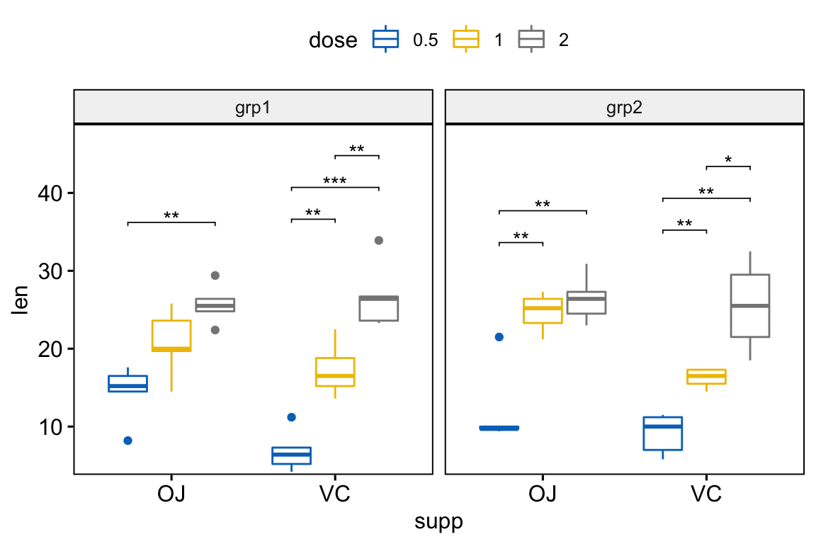
# Bar plots with p-values
stat.test <- stat.test %>%
  add_xy_position(x = "supp", fun = "mean_sd", dodge = 0.8)
bp +
  stat_pvalue_manual(
    stat.test, label = "p.adj.signif", tip.length = 0.01,
    hide.ns = TRUE
    ) +
  scale_y_continuous(expand = expansion(mult = c(0.01, 0.1)))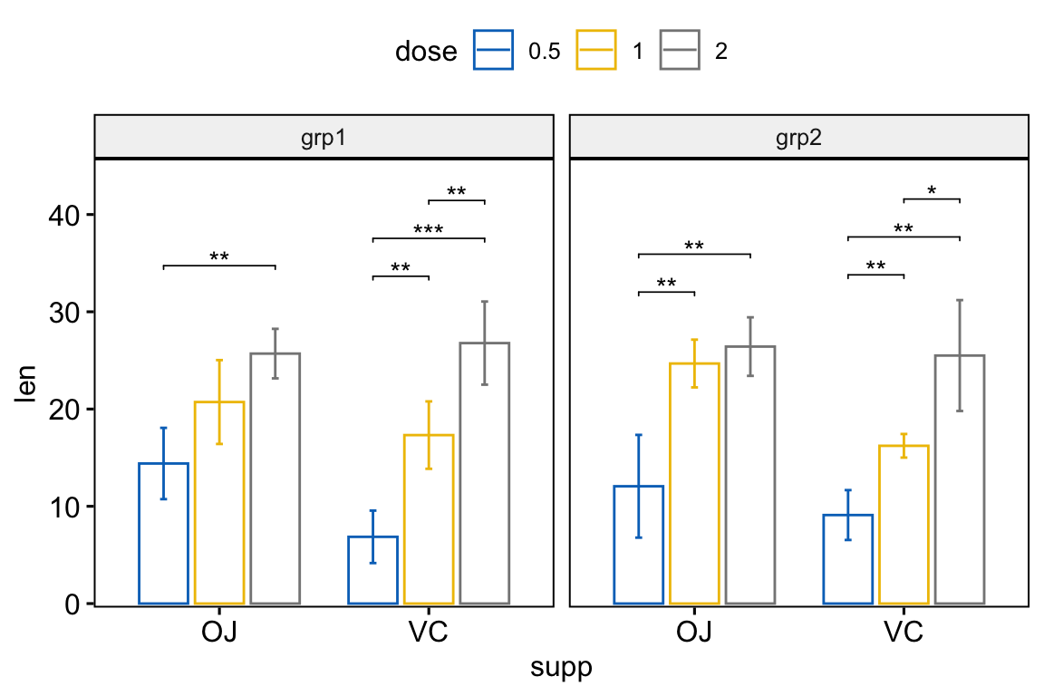
Pairwise comparisons against a reference group
Statistical test:
stat.test <- df %>%
  group_by(supp, group) %>%
  t_test(len ~ dose, ref.group = "0.5")
stat.test
## # A tibble: 8 x 12
## supp group .y. group1 group2 n1 n2 statistic df p p.adj p.adj.signif
## * <fct> <fct> <chr> <chr> <chr> <int> <int> <dbl> <dbl> <dbl> <dbl> <chr>
## 1 OJ grp1 len 0.5 1 5 5 -2.50 7.80 0.038 0.038 *
## 2 OJ grp1 len 0.5 2 5 5 -5.66 7.13 0.000717 0.001 **
## 3 OJ grp2 len 0.5 1 5 5 -4.85 5.65 0.003 0.003 **
## 4 OJ grp2 len 0.5 2 5 5 -5.28 6.35 0.002 0.003 **
## 5 VC grp1 len 0.5 1 5 5 -5.33 7.54 0.000855 0.000855 ***
## 6 VC grp1 len 0.5 2 5 5 -8.81 6.75 0.0000606 0.000121 ***
## # … with 2 more rowsAdd p-values onto the plots:
# Box plots with p-values
stat.test <- stat.test %>%
  add_xy_position(x = "supp", dodge = 0.8)
bxp +
  stat_pvalue_manual(
    stat.test, label = "p.adj.signif", tip.length = 0.01
    ) +
  scale_y_continuous(expand = expansion(mult = c(0.01, 0.1)))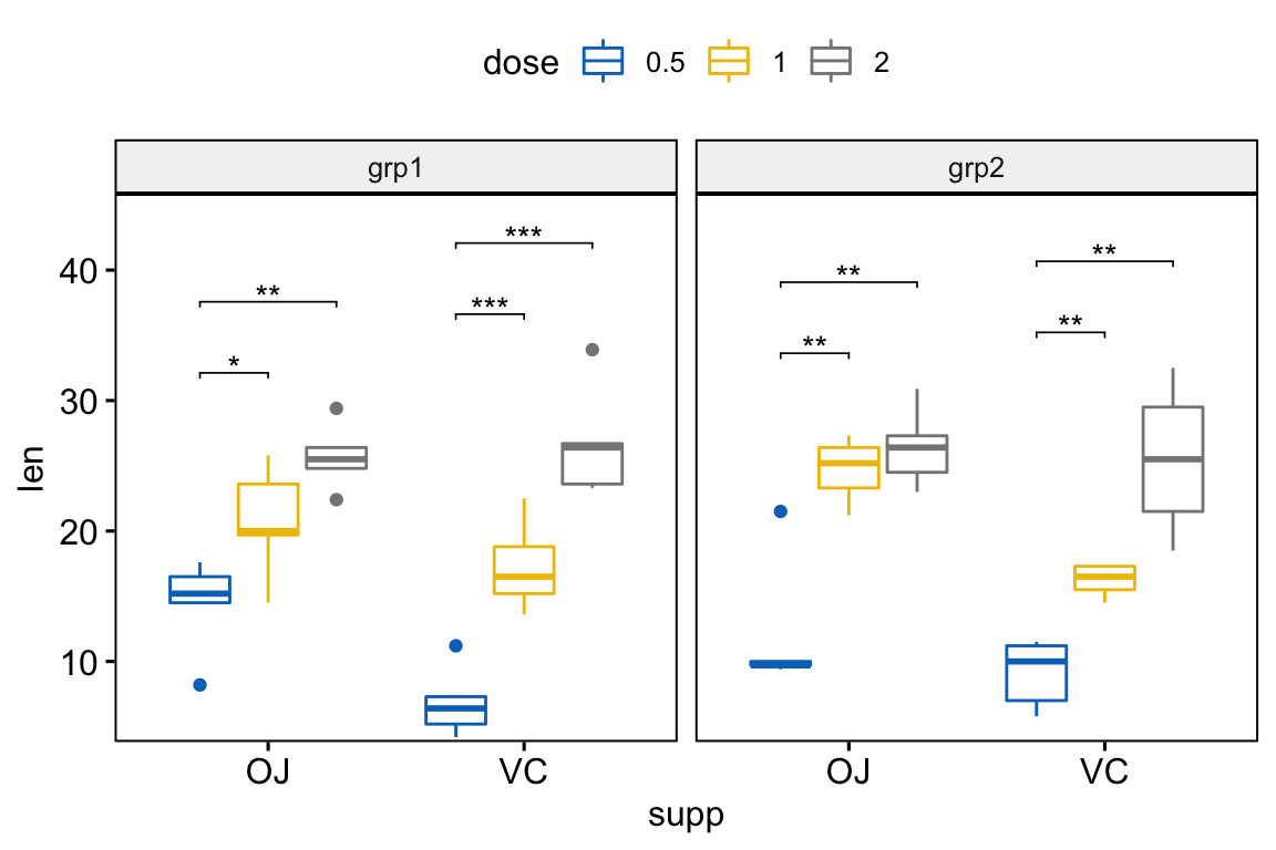
# Bar plots with p-values
stat.test <- stat.test %>%
  add_xy_position(x = "supp", fun = "mean_sd", dodge = 0.8)
bp +
  stat_pvalue_manual(
    stat.test, label = "p.adj.signif", tip.length = 0.01
    ) +
  scale_y_continuous(expand = expansion(mult = c(0.01, 0.1)))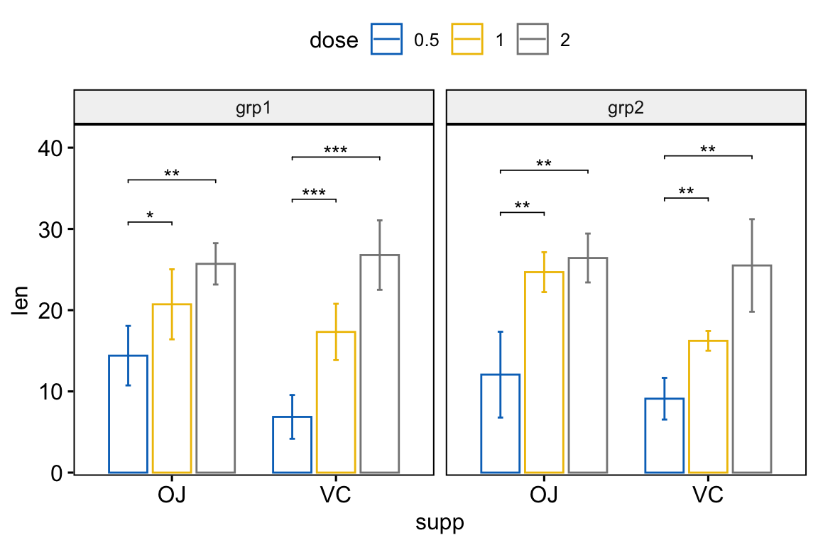
Conclusion
This article describes how to add p-values onto ggplot facets, such as box plots and bar plots. See other related frequently questions: ggpubr FAQ.
Recommended for you
This section contains best data science and self-development resources to help you on your path.
Books - Data Science
Our Books
- Practical Guide to Cluster Analysis in R by A. Kassambara (Datanovia)
- Practical Guide To Principal Component Methods in R by A. Kassambara (Datanovia)
- Machine Learning Essentials: Practical Guide in R by A. Kassambara (Datanovia)
- R Graphics Essentials for Great Data Visualization by A. Kassambara (Datanovia)
- GGPlot2 Essentials for Great Data Visualization in R by A. Kassambara (Datanovia)
- Network Analysis and Visualization in R by A. Kassambara (Datanovia)
- Practical Statistics in R for Comparing Groups: Numerical Variables by A. Kassambara (Datanovia)
- Inter-Rater Reliability Essentials: Practical Guide in R by A. Kassambara (Datanovia)
Others
- R for Data Science: Import, Tidy, Transform, Visualize, and Model Data by Hadley Wickham & Garrett Grolemund
- Hands-On Machine Learning with Scikit-Learn, Keras, and TensorFlow: Concepts, Tools, and Techniques to Build Intelligent Systems by Aurelien Géron
- Practical Statistics for Data Scientists: 50 Essential Concepts by Peter Bruce & Andrew Bruce
- Hands-On Programming with R: Write Your Own Functions And Simulations by Garrett Grolemund & Hadley Wickham
- An Introduction to Statistical Learning: with Applications in R by Gareth James et al.
- Deep Learning with R by François Chollet & J.J. Allaire
- Deep Learning with Python by François Chollet
Version:


Hi, thanks for the nice feature, chow can we do that in plot_ly ?, any insights are appreciated
Hi this is great- is stat.test a function? it keeps coming back unrecognised for me
stat.test is used as a variable in these examples. It is used to store the results of the respective statistical tests performed [notice the rstatix package and the accompanying pipes (%>%) that perform the actual tests].
This was soooo helpful! Thank you!
Hi, Should we use anova-post hoc test for the part “Multipanel plots containing three or more groups by panel”? If yes, could you show me how to do it? Thank you very much!
This article may very well have saved my life. Very well written, had every use case imaginable. Exactly what I needed after hours of looking
Hi, can you help me? I have a facet_wrap with 5 facets, boxplot with different numbers of boxes per facet. I wanna have aaall the p-values of pairwise comparisons.
I put the following, but receive error messages:
stat.test % group_by(method, year) %>% t_test(H~crop) %>%
ggplot(aes(crop, H, fill=crop))+
geom_boxplot()+
facet_wrap(~method, scales=”free_x”)+
stat_pvalue_manual(stat.test, label = “p.adj.signif”, tip.length = 0.01)
what do I need to change?
Thanks a lot!!!
For those who has problems integrating this approach in ggplot2 plots just use
inherit.aes = F inside stat_pvalue_manual()