This articles describes how to create and customize an interactive heatmap in R using the heatmaply R package, which is based on the ggplot2 and plotly.js engine.
Contents:
Prerequisites
Install the required R package:
install.packages("heatmaply")Load the package:
library("heatmaply")Data preparation
Normalize the data to make the variables values comparable.
df <- normalize(mtcars)Note that, other data transformation functions are scale() (for standardization), percentize() [for percentile transformation; available in the heatmaply R package]. Read more: How to Normalize and Standardize Data in R for Great Heatmap Visualization.
Basic heatmap
heatmaply(df)Heatmaply has also the option to produce a static heatmap using the ggheatmap R function:
ggheatmap(df)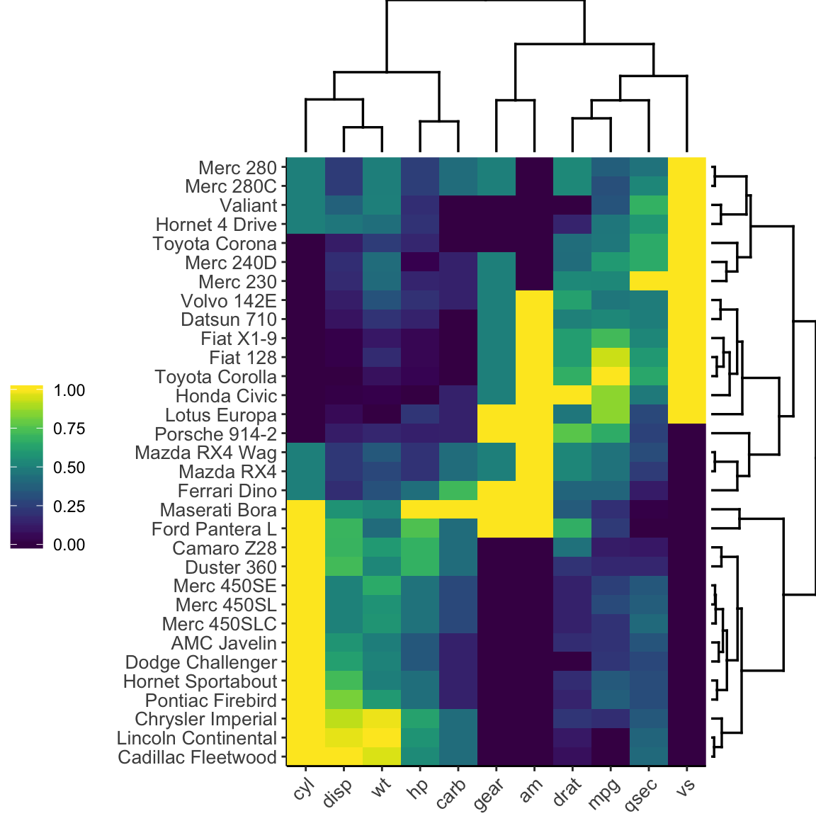
Note that, heatmaply uses the seriation package to find an optimal ordering of rows and columns.
The function heatmaply() has an option named seriate, which possible values include:
“OLO”(Optimal leaf ordering): This is the default value.“mean”: This option gives the output we would get by default from heatmap functions in other packages such asgplots::heatmap.2().“none”: This option gives us the dendrograms without any rotation. The result is similar to what we would get by default from hclust.
Replicating the dendrogram ordering of gplots::heatmap.2().
- Create a heatmap using the
gplotsR package:
gplots::heatmap.2(
  as.matrix(df),
  trace = "none",
  col = viridis(100),
  key = FALSE
)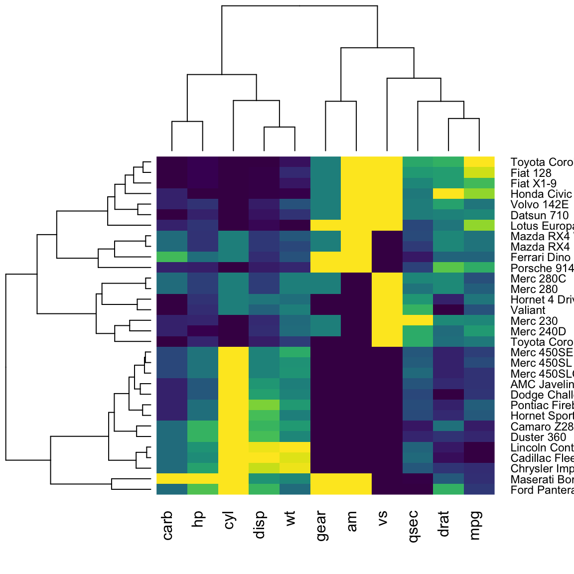
- Create a similar version using the
heatmaplyR package:
heatmaply(
  as.matrix(df),
  seriate = "mean",
  row_dend_left = TRUE,
  plot_method = "plotly"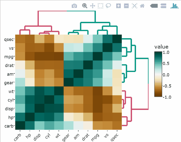
)Split rows and columns dendrograms into k groups
The k-means algorithm is used.
heatmaply(
  df,
  k_col = 2,
  k_row = 2
)Change color palettes
The default color palette is viridis. Other excellent color palettes are available in the packages cetcolor and RColorBrewer.
Use the viridis colors with the option “magma”:
heatmaply(
  df,
  colors = viridis(n = 256,  option = "magma"),
  k_col = 2,
  k_row = 2
)Use the RColorBrewer palette :
library(RColorBrewer)
heatmaply(
  df,
  colors = colorRampPalette(brewer.pal(3, "RdBu"))(256),
  k_col = 2,
  k_row = 2
)Specify customized gradient colors using the function scale_fill_gradient2() [ggplot2 package].
gradient_col <- ggplot2::scale_fill_gradient2(
   low = "blue", high = "red",
    midpoint = 0.5, limits = c(0, 1)
  )
heatmaply(
  df,
  scale_fill_gradient_fun = gradient_col
)Customize dendrograms using dendextend
A user can supply their own dendrograms for the rows/columns of the heatmaply using the Rowv and the Colv parameters:
library(dendextend)
# Create dendrogram for rows
mycols <- c("#2E9FDF", "#00AFBB", "#E7B800", "#FC4E07")
row_dend <-  df %>%
  dist() %>%
  hclust() %>%
  as.dendrogram() %>%
  set("branches_lwd", 1) %>%
  set("branches_k_color", mycols[1:3], k = 3)

# Create dendrogram for columns
col_dend <-  df %>%
  t() %>%
  dist() %>%
  hclust() %>%
  as.dendrogram() %>%
  set("branches_lwd", 1) %>%
  set("branches_k_color", mycols[1:2], k = 2)
# Visualize the heatmap
heatmaply(
df,
Rowv = row_dend,
Colv = col_dend
)Add annotation based on additional factors
The following R code adds annotation on column and row sides:
heatmaply(
  df[, -c(8, 9)],
  col_side_colors = c(rep(0, 5), rep(1, 4)),
  row_side_colors = df[, 8:9]
)Add text annotations
By default, the colour of the text on each cell is chosen to ensure legibility, with black text shown over light cells and white text shown over dark cells.
heatmaply(df, cellnote = mtcars)Add custom hover text
mat <- df
mat[] <- paste("This cell is", rownames(mat))
mat[] <- lapply(colnames(mat), function(colname) {
    paste0(mat[, colname], ", ", colname)
})
heatmaply(
df,
custom_hovertext = mat
)Saving your heatmaply into a file
Create an interactive html file:
dir.create("folder")
heatmaply(mtcars, file = "folder/heatmaply_plot.html")
browseURL("folder/heatmaply_plot.html")
Saving a static file (png/jpeg/pdf). Before the first time using this code you may need to first run: webshot::install_phantomjs() or to install plotly’s orca program.
dir.create("folder")
heatmaply(mtcars, file = "folder/heatmaply_plot.png")
browseURL("folder/heatmaply_plot.png")
Save the file, without plotting it in the console:
tmp <- heatmaply(mtcars, file = "folder/heatmaply_plot.png")
rm(tmp)
References
Recommended for you
This section contains best data science and self-development resources to help you on your path.
Books - Data Science
Our Books
- Practical Guide to Cluster Analysis in R by A. Kassambara (Datanovia)
- Practical Guide To Principal Component Methods in R by A. Kassambara (Datanovia)
- Machine Learning Essentials: Practical Guide in R by A. Kassambara (Datanovia)
- R Graphics Essentials for Great Data Visualization by A. Kassambara (Datanovia)
- GGPlot2 Essentials for Great Data Visualization in R by A. Kassambara (Datanovia)
- Network Analysis and Visualization in R by A. Kassambara (Datanovia)
- Practical Statistics in R for Comparing Groups: Numerical Variables by A. Kassambara (Datanovia)
- Inter-Rater Reliability Essentials: Practical Guide in R by A. Kassambara (Datanovia)
Others
- R for Data Science: Import, Tidy, Transform, Visualize, and Model Data by Hadley Wickham & Garrett Grolemund
- Hands-On Machine Learning with Scikit-Learn, Keras, and TensorFlow: Concepts, Tools, and Techniques to Build Intelligent Systems by Aurelien Géron
- Practical Statistics for Data Scientists: 50 Essential Concepts by Peter Bruce & Andrew Bruce
- Hands-On Programming with R: Write Your Own Functions And Simulations by Garrett Grolemund & Hadley Wickham
- An Introduction to Statistical Learning: with Applications in R by Gareth James et al.
- Deep Learning with R by François Chollet & J.J. Allaire
- Deep Learning with Python by François Chollet
Version:
 Français


No Comments