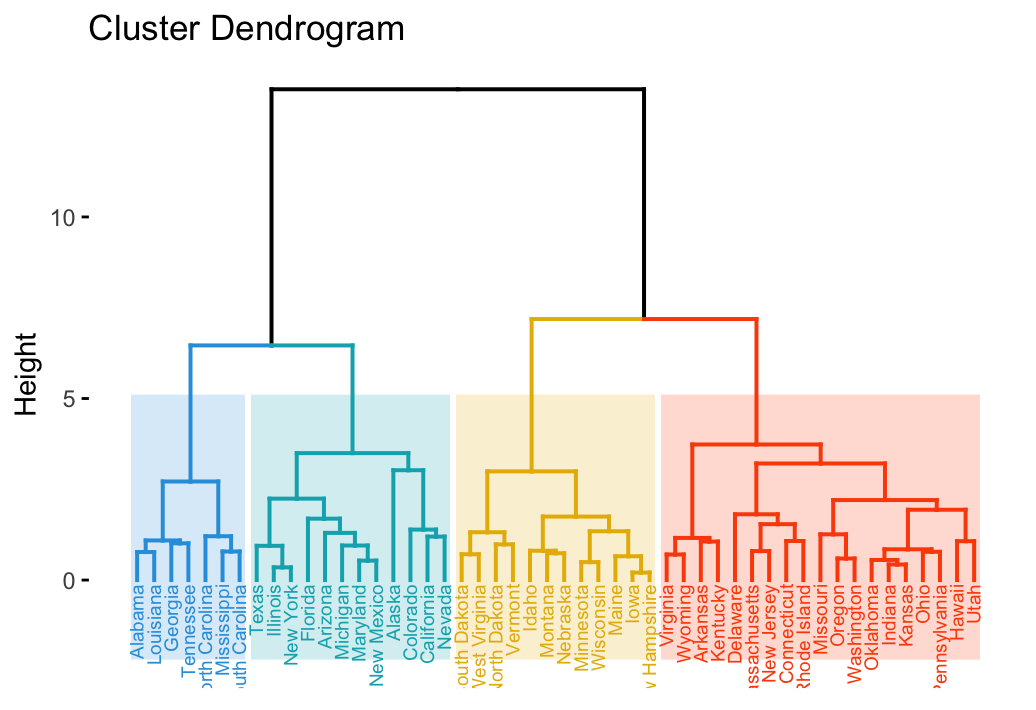
As described in previous chapters, a dendrogram is a tree-based representation of a data created using hierarchical clustering methods.
In this article, we provide examples of dendrograms visualization using R software. Additionally, we show how to save and to zoom a large dendrogram.
Contents:
Related Book
Practical Guide to Cluster Analysis in RComputing hierarchical clustering
We start by computing hierarchical clustering using the USArrests data sets:
# Load data
data(USArrests)

# Compute distances and hierarchical clustering
dd <- dist(scale(USArrests), method = "euclidean")
hc <- hclust(dd, method = "ward.D2")
R packages and functions
To visualize the dendrogram, we’ll use the following R functions and packages:
- fviz_dend()[in factoextra R package] to create easily a ggplot2-based beautiful dendrogram.
- dendextend package to manipulate dendrograms
Before continuing, install the required package as follow:
install.packages(c("factoextra", "dendextend"))Creating dendrograms
We’ll use the function fviz_dend()[in factoextra R package] to create easily a beautiful dendrogram using either the R base plot or ggplot2. It provides also an option for drawing circular dendrograms and phylogenic-like trees.
To create a basic dendrograms, type this:
library(factoextra)
fviz_dend(hc, cex = 0.5)
You can use the arguments main, sub, xlab, ylab to change plot titles as follow:
fviz_dend(hc, cex = 0.5,
          main = "Dendrogram - ward.D2",
          xlab = "Objects", ylab = "Distance", sub = "")
To draw a horizontal dendrogram, type this:
fviz_dend(hc, cex = 0.5, horiz = TRUE)It’s also possible to cut the tree at a given height for partitioning the data into multiple groups as described in the previous chapter. In this case, it’s possible to color branches by groups and to add rectangle around each group.
For example:

To change the plot theme, use the argument ggtheme, which allowed values include ggplot2 official themes [ theme_gray(), theme_bw(), theme_minimal(), theme_classic(), theme_void()] or any other user-defined ggplot2 themes.
fviz_dend(hc, k = 4,                 # Cut in four groups
          cex = 0.5,                 # label size
          k_colors = c("#2E9FDF", "#00AFBB", "#E7B800", "#FC4E07"),
          color_labels_by_k = TRUE,  # color labels by groups
          ggtheme = theme_gray()     # Change theme
          )
Allowed values for k_color include brewer palettes from RColorBrewer Package (e.g. “RdBu”, “Blues”, “Dark2”, “Set2”, …; ) and scientific journal palettes from ggsci R package (e.g.: “npg”, “aaas”, “lancet”, “jco”, “ucscgb”, “uchicago”, “simpsons” and “rickandmorty”).
In the R code below, we’ll change group colors using “jco” (journal of clinical oncology) color palette:
Manipulating dendrograms using dendextend
The package dendextend provide functions for changing easily the appearance of a dendrogram and for comparing dendrograms.
In this section we’ll use the chaining operator (%>%) to simplify our code. The chaining operator turns x %>% f(y) into f(x, y) so you can use it to rewrite multiple operations such that they can be read from left-to-right, top-to-bottom. For instance, the results of the two R codes below are equivalent.
- Standard R code for creating a dendrogram:
data <- scale(USArrests)
dist.res <- dist(data)
hc <- hclust(dist.res, method = "ward.D2")
dend <- as.dendrogram(hc)
plot(dend)- R code for creating a dendrogram using chaining operator:
library(dendextend)
dend <- USArrests[1:5,] %>% # data
        scale %>% # Scale the data
        dist %>% # calculate a distance matrix,
        hclust(method = "ward.D2") %>% # Hierarchical clustering
        as.dendrogram # Turn the object into a dendrogram.
plot(dend)- Functions to customize dendrograms: The function set() [in dendextend package] can be used to change the parameters of a dendrogram. The format is:
set(object, what, value)- object: a dendrogram object
- what: a character indicating what is the property of the tree that should be set/updated
- value: a vector with the value to set in the tree (the type of the value depends on the “what”).
Possible values for the argument what include:
| Value for the argument what | Description |
|---|---|
| labels | set the labels |
| labels_colors and labels_cex | Set the color and the size of labels, respectively |
| leaves_pch, leaves_cex and leaves_col | set the point type, size and color for leaves, respectively |
| nodes_pch, nodes_cex and nodes_col | set the point type, size and color for nodes, respectively |
| hang_leaves | hang the leaves |
| branches_k_color | color the branches |
| branches_col, branches_lwd , branches_lty | Set the color, the line width and the line type of branches, respectively |
| by_labels_branches_col, by_labels_branches_lwd and by_labels_branches_lty | Set the color, the line width and the line type of branches with specific labels, respectively |
| clear_branches and clear_leaves | Clear branches and leaves, respectively |
- Examples:
library(dendextend)
# 1. Create a customized dendrogram
mycols <- c("#2E9FDF", "#00AFBB", "#E7B800", "#FC4E07")
dend <-  as.dendrogram(hc) %>%
   set("branches_lwd", 1) %>% # Branches line width
   set("branches_k_color", mycols, k = 4) %>% # Color branches by groups
   set("labels_colors", mycols, k = 4) %>%  # Color labels by groups
   set("labels_cex", 0.5) # Change label size

# 2. Create plot
fviz_dend(dend)
Summary
We described functions and packages for visualizing and customizing dendrograms including:
- fviz_dend() [in factoextra R package], which provides convenient solutions for plotting easily a beautiful dendrogram. It can be used to create rectangular and circular dendrograms, as well as, a phylogenic tree.
- and the dendextend package, which provides a flexible methods to customize dendrograms.
Additionally, we described how to plot a subset of large dendrograms.
Recommended for you
This section contains best data science and self-development resources to help you on your path.
Books - Data Science
Our Books
- Practical Guide to Cluster Analysis in R by A. Kassambara (Datanovia)
- Practical Guide To Principal Component Methods in R by A. Kassambara (Datanovia)
- Machine Learning Essentials: Practical Guide in R by A. Kassambara (Datanovia)
- R Graphics Essentials for Great Data Visualization by A. Kassambara (Datanovia)
- GGPlot2 Essentials for Great Data Visualization in R by A. Kassambara (Datanovia)
- Network Analysis and Visualization in R by A. Kassambara (Datanovia)
- Practical Statistics in R for Comparing Groups: Numerical Variables by A. Kassambara (Datanovia)
- Inter-Rater Reliability Essentials: Practical Guide in R by A. Kassambara (Datanovia)
Others
- R for Data Science: Import, Tidy, Transform, Visualize, and Model Data by Hadley Wickham & Garrett Grolemund
- Hands-On Machine Learning with Scikit-Learn, Keras, and TensorFlow: Concepts, Tools, and Techniques to Build Intelligent Systems by Aurelien Géron
- Practical Statistics for Data Scientists: 50 Essential Concepts by Peter Bruce & Andrew Bruce
- Hands-On Programming with R: Write Your Own Functions And Simulations by Garrett Grolemund & Hadley Wickham
- An Introduction to Statistical Learning: with Applications in R by Gareth James et al.
- Deep Learning with R by François Chollet & J.J. Allaire
- Deep Learning with Python by François Chollet


Hi, thanks for the amazing tutorial! Would you know what the “height” on the Y-axis of the dendrogram mean? How is the value calculated? thanks!
The height of the fusion, provided on the vertical axis, indicates the (dis)similarity/distance between two objects/clusters. The higher the height of the fusion, the less similar the objects are. This height is known as the cophenetic distance between the two objects. Read more: https://www.datanovia.com/en/lessons/agglomerative-hierarchical-clustering/
How can I modify the vertical scale? I noticed your leaves are at 0, but I cannot manage to do the same to mine
Hi, is there a way to color the block of different groups without coloring the name labels at the end? thanks!
You need to specify the argument color_labels_by_k = FALSE.
# Load data data(USArrests) # Compute distances and hierarchical clustering dd <- dist(scale(USArrests), method = "euclidean") hc <- hclust(dd, method = "ward.D2") # Visualize library(factoextra) fviz_dend(hc, k = 4, # Cut in four groups cex = 0.5, # label size k_colors = c("#2E9FDF", "#00AFBB", "#E7B800", "#FC4E07"), color_labels_by_k = FALSE)Hi, Kassambara
thanks for you reply. I may not be clear about what I mean. I still want to keep the colored blocks for each group on the branch, but I don’t want the color to cover the labels. Is there a parameter that can do the trick? thanks!
just found I can adjust the lower part of the rect easily with low_rect = value. thanks!
low_rect= 0