Boxplots (or Box plots) are used to visualize the distribution of a grouped continuous variable through their quartiles.
Box Plots have the advantage of taking up less space compared to Histogram and Density plot. This is useful when comparing distributions between many groups.
Visualizing data using boxplots makes it possible to:
- Inspect the key values of the data, including: the average, median, first and third quartiles, etc
- Identify potential outliers in the data
- See whether the data is tightly grouped, symmetrical or skewed, etc
This article describes how to create and customize boxplot using the ggplot2 R package.
Contents:
Related Book
GGPlot2 Essentials for Great Data Visualization in RKey R functions
- Key R function:
geom_boxplot()[ggplot2 package] - Key arguments to customize the plot:
width: the width of the box plotnotch: logical. If TRUE, creates a notched boxplot. The notch displays a confidence interval around the median which is normally based on themedian +/- 1.58*IQR/sqrt(n). Notches are used to compare groups; if the notches of two boxes do not overlap, this is a strong evidence that the medians differ.color,size,linetype: Border line color, size and typefill: box plot areas fill coloroutlier.colour,outlier.shape,outlier.size: The color, the shape and the size for outlying points.
Data preparation
- Demo dataset:
ToothGrowth- Continuous variable:
len(tooth length). Used on y-axis - Grouping variable:
dose(dose levels of vitamin C: 0.5, 1, and 2 mg/day). Used on x-axis.
- Continuous variable:
First, convert the variable dose from a numeric to a discrete factor variable:
data("ToothGrowth")
ToothGrowth$dose <- as.factor(ToothGrowth$dose)
head(ToothGrowth, 4)
## len supp dose
## 1 4.2 VC 0.5
## 2 11.5 VC 0.5
## 3 7.3 VC 0.5
## 4 5.8 VC 0.5Loading required R package
Load the ggplot2 package and set the default theme to theme_classic() with the legend at the top of the plot:
library(ggplot2)
theme_set(
  theme_classic() +
    theme(legend.position = "top")
  )
Basic boxplots
We start by initiating a plot named e, then we’ll add layers:
# Default plot
e <- ggplot(ToothGrowth, aes(x = dose, y = len))
e + geom_boxplot()
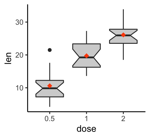
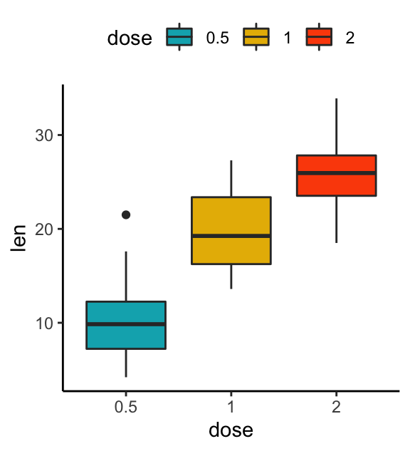
# Notched box plot with mean points
e + geom_boxplot(notch = TRUE, fill = "lightgray")+
stat_summary(fun.y = mean, geom = "point",
shape = 18, size = 2.5, color = "#FC4E07")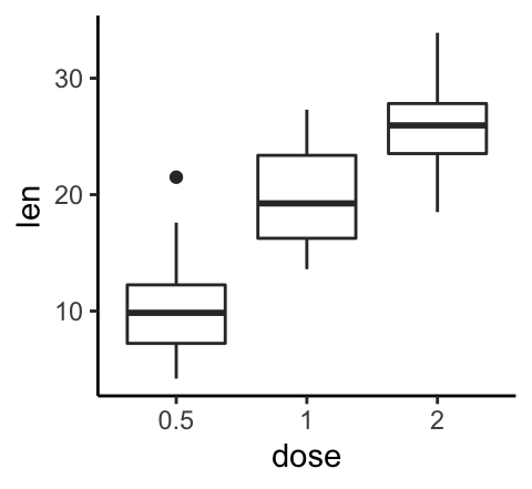
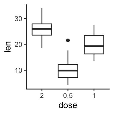
Note that, it’s possible to use the function scale_x_discrete() for:
- choosing which items to display: for example c(“0.5”, “2”),
- changing the order of items: for example from c(“0.5”, “1”, “2”) to c(“2”, “0.5”, “1”)
For example, type this:
# Choose which items to display: group "0.5" and "2"
e + geom_boxplot() +
  scale_x_discrete(limits=c("0.5", "2"))

# Change the default order of items
e + geom_boxplot() +
  scale_x_discrete(limits=c("2", "0.5", "1"))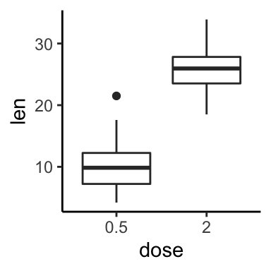
Change boxplot colors by groups:
The following R code will change the boxplot line and fill color. The functions scale_color_manual() and scale_fill_manual() are used to specify custom colors for each group.
# Color by group (dose)
e + geom_boxplot(aes(color = dose))+
  scale_color_manual(values = c("#00AFBB", "#E7B800", "#FC4E07"))

# Change fill color by group (dose)
e + geom_boxplot(aes(fill = dose)) +
  scale_fill_manual(values = c("#00AFBB", "#E7B800", "#FC4E07"))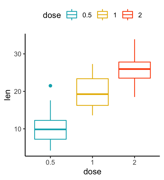
Create a boxplot with multiple groups
Two different grouping variables are used: dose on x-axis and supp as fill color (legend variable).
The space between the grouped box plots is adjusted using the function position_dodge().
e2 <- e +
  geom_boxplot(aes(fill = supp), position = position_dodge(0.9) ) +
  scale_fill_manual(values = c("#999999", "#E69F00"))
e2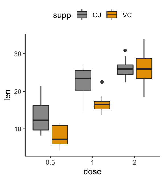
Multiple panel boxplots
You can split the plot into multiple panel using the function facet_wrap():
e2 + facet_wrap(~supp)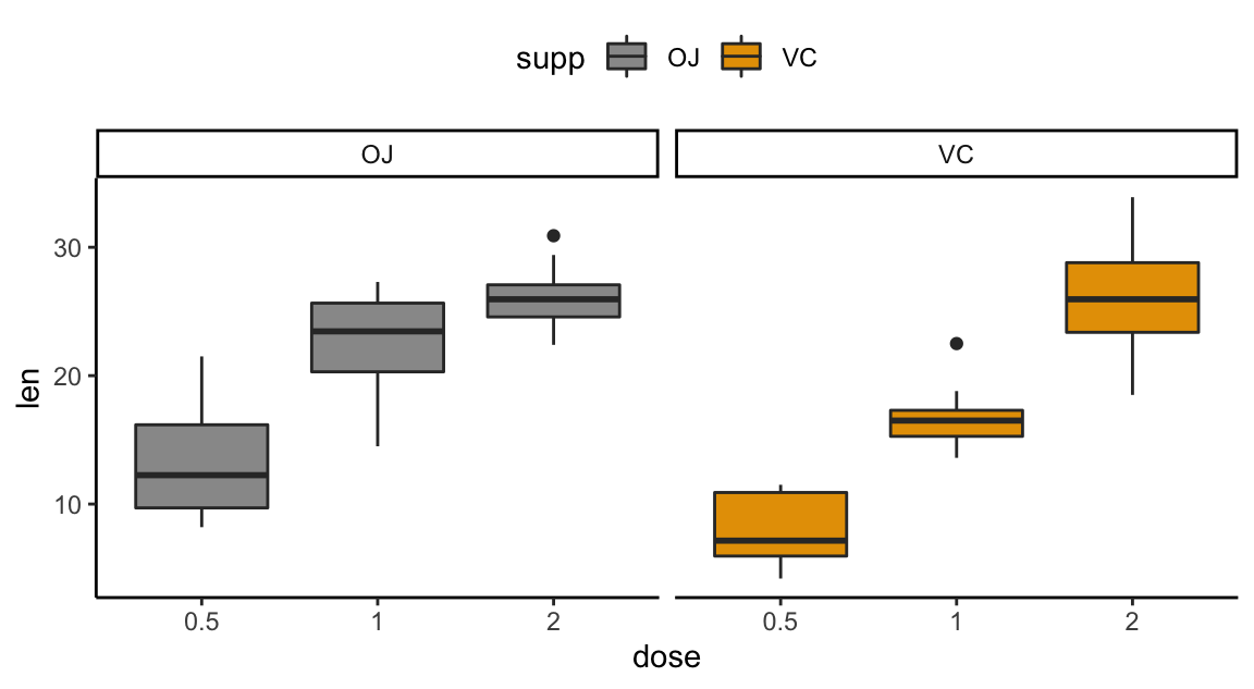
Conclusion
This article describes how to create a boxplot using the ggplot2 package.
Recommended for you
This section contains best data science and self-development resources to help you on your path.
Books - Data Science
Our Books
- Practical Guide to Cluster Analysis in R by A. Kassambara (Datanovia)
- Practical Guide To Principal Component Methods in R by A. Kassambara (Datanovia)
- Machine Learning Essentials: Practical Guide in R by A. Kassambara (Datanovia)
- R Graphics Essentials for Great Data Visualization by A. Kassambara (Datanovia)
- GGPlot2 Essentials for Great Data Visualization in R by A. Kassambara (Datanovia)
- Network Analysis and Visualization in R by A. Kassambara (Datanovia)
- Practical Statistics in R for Comparing Groups: Numerical Variables by A. Kassambara (Datanovia)
- Inter-Rater Reliability Essentials: Practical Guide in R by A. Kassambara (Datanovia)
Others
- R for Data Science: Import, Tidy, Transform, Visualize, and Model Data by Hadley Wickham & Garrett Grolemund
- Hands-On Machine Learning with Scikit-Learn, Keras, and TensorFlow: Concepts, Tools, and Techniques to Build Intelligent Systems by Aurelien Géron
- Practical Statistics for Data Scientists: 50 Essential Concepts by Peter Bruce & Andrew Bruce
- Hands-On Programming with R: Write Your Own Functions And Simulations by Garrett Grolemund & Hadley Wickham
- An Introduction to Statistical Learning: with Applications in R by Gareth James et al.
- Deep Learning with R by François Chollet & J.J. Allaire
- Deep Learning with Python by François Chollet
Version:
 Français

No Comments