Python for R Users: Transitioning to Python for Data Science
A Practical Guide for R Users to Embrace Python
This tutorial helps R users transition to Python by highlighting equivalent functionalities and workflows. Through side-by-side examples in data manipulation, visualization, and modeling, you’ll learn how to leverage Python for data science while building on your existing R skills.
Python for R users, transition from R to Python, Python for data science R users, R to Python tutorial, data science workflows in Python and R
Introduction
Transitioning from R to Python can seem daunting, but many concepts and workflows are surprisingly similar between the two languages. This guide is designed specifically for R users who want to learn Python for data science. We’ll provide side-by-side examples of common data science tasks—including data manipulation, visualization, and modeling—to illustrate equivalent functionalities in both languages. In addition, you’ll receive practical tips to help you navigate the transition smoothly.
Data Manipulation: dplyr vs. pandas
Below is an example comparing how you filter and summarize data in R using dplyr and in Python using pandas.
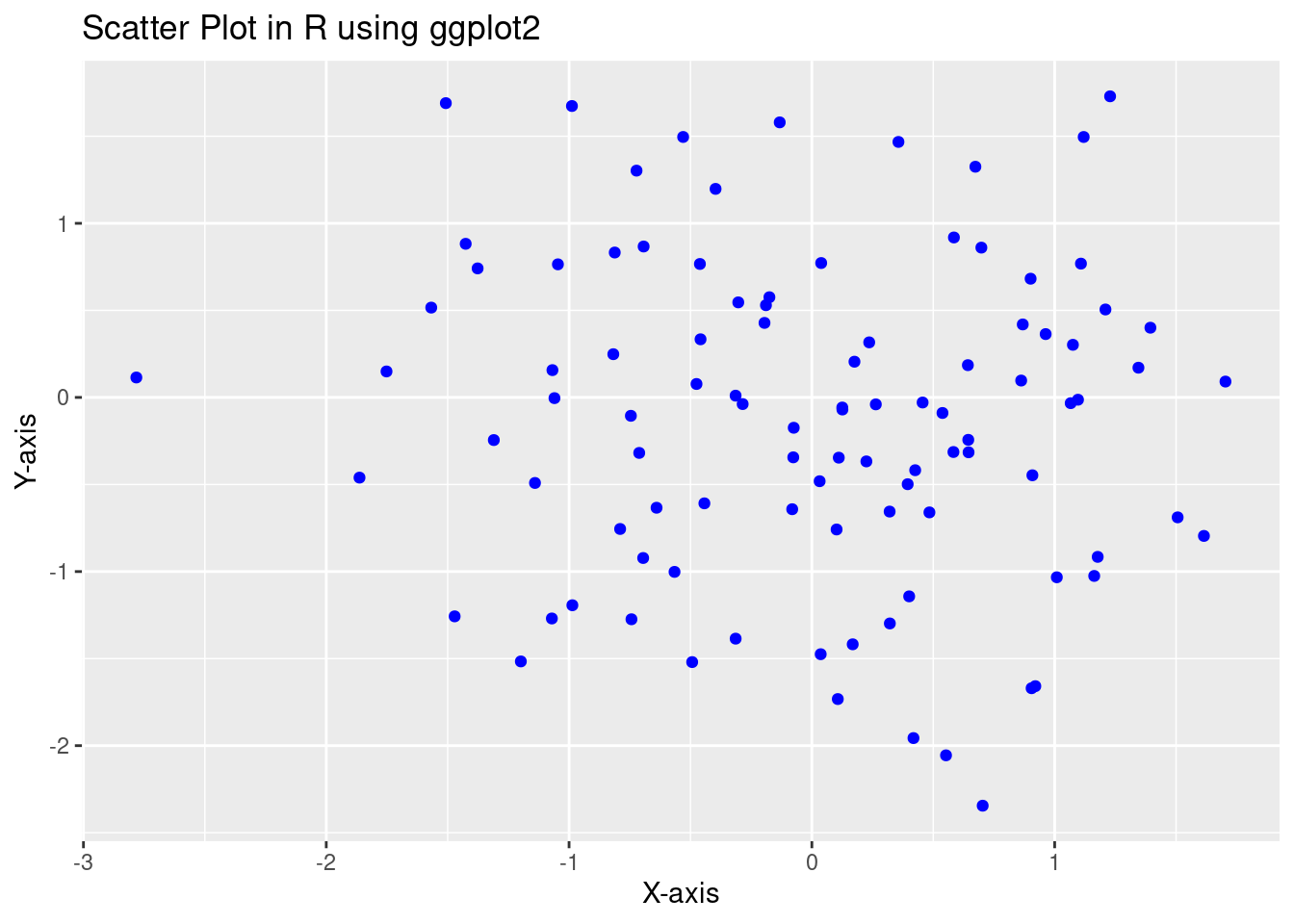
library(ggplot2)# Generate sample datadata <-data.frame(x =rnorm(100), y =rnorm(100))# Create a scatter plotggplot(data, aes(x = x, y = y)) +geom_point(color ="blue") +labs(title ="Scatter Plot in R using ggplot2", x ="X-axis", y ="Y-axis")
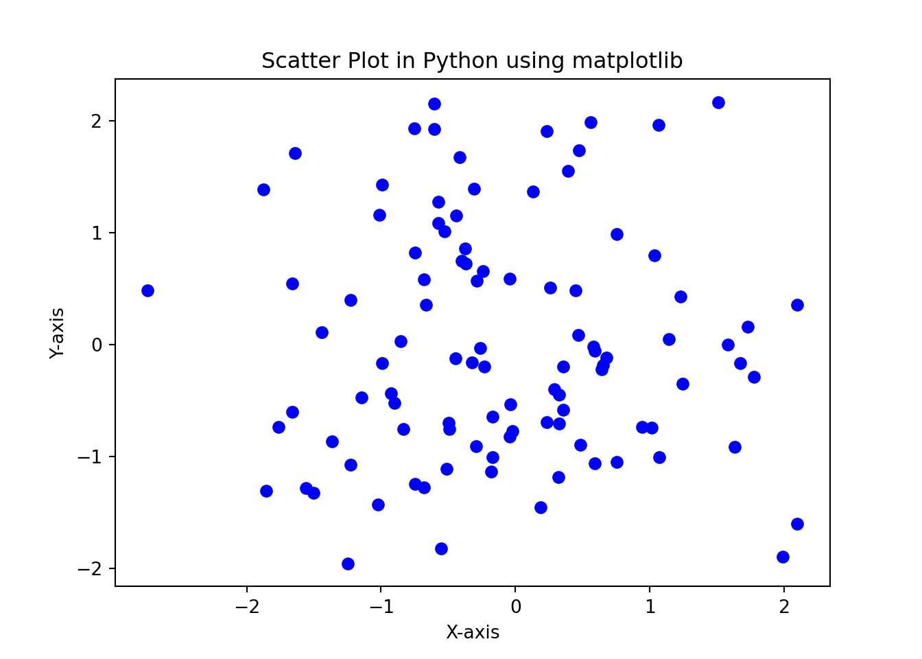
import matplotlib.pyplot as pltimport numpy as np# Generate sample datax = np.random.randn(100)y = np.random.randn(100)# Create a scatter plotplt.scatter(x, y, color='blue')plt.title("Scatter Plot in Python using matplotlib")plt.xlabel("X-axis")plt.ylabel("Y-axis")plt.show()
Machine Learning: lm() vs. scikit-learn
Here’s a basic comparison between a linear regression model in R and one in Python.
data <- mtcarsmodel_r <-lm(mpg ~ wt, data = data)summary(model_r)
Call:
lm(formula = mpg ~ wt, data = data)

Residuals:
    Min      1Q  Median      3Q     Max
-4.5432 -2.3647 -0.1252  1.4096  6.8727

Coefficients:
            Estimate Std. Error t value Pr(>|t|)
(Intercept)  37.2851     1.8776  19.858  < 2e-16 ***
wt           -5.3445     0.5591  -9.559 1.29e-10 ***
---
Signif. codes:  0 '***' 0.001 '**' 0.01 '*' 0.05 '.' 0.1 ' ' 1

Residual standard error: 3.046 on 30 degrees of freedom
Multiple R-squared:  0.7528,    Adjusted R-squared:  0.7446
F-statistic: 91.38 on 1 and 30 DF,  p-value: 1.294e-10
import pandas as pdfrom sklearn.linear_model import LinearRegressionimport numpy as np# Create a simple dataset for demonstrationdata = pd.DataFrame({'wt': np.random.rand(32)*5,'mpg': np.random.rand(32)*30})# Fit a linear regression modelmodel_py = LinearRegression().fit(data[['wt']], data['mpg'])print("Coefficient:", model_py.coef_, "Intercept:", model_py.intercept_)
Leverage Your Existing Knowledge:
Many R packages have Python counterparts with similar functionalities (e.g., dplyr vs. pandas, ggplot2 vs. matplotlib/Seaborn). Use these similarities to accelerate your learning.
Practice Side-by-Side:
Experiment with side-by-side examples to understand how each language handles data operations, visualization, and modeling. This comparison can help solidify your understanding and highlight subtle differences.
Start Small:
Begin with simple scripts and gradually tackle more complex tasks. Focus on one functionality at a time.
Utilize Community Resources:
Leverage online tutorials, forums, and documentation for both R and Python. Many communities, including Datonovia, offer resources specifically for transitioning between the two languages.
Conclusion
Transitioning from R to Python doesn’t have to be overwhelming. By exploring side-by-side examples in data manipulation, visualization, and modeling, you can build a solid foundation in Python while utilizing your existing R knowledge. This guide serves as a starting point—experiment, explore, and leverage the best of both worlds to enhance your data science toolkit.